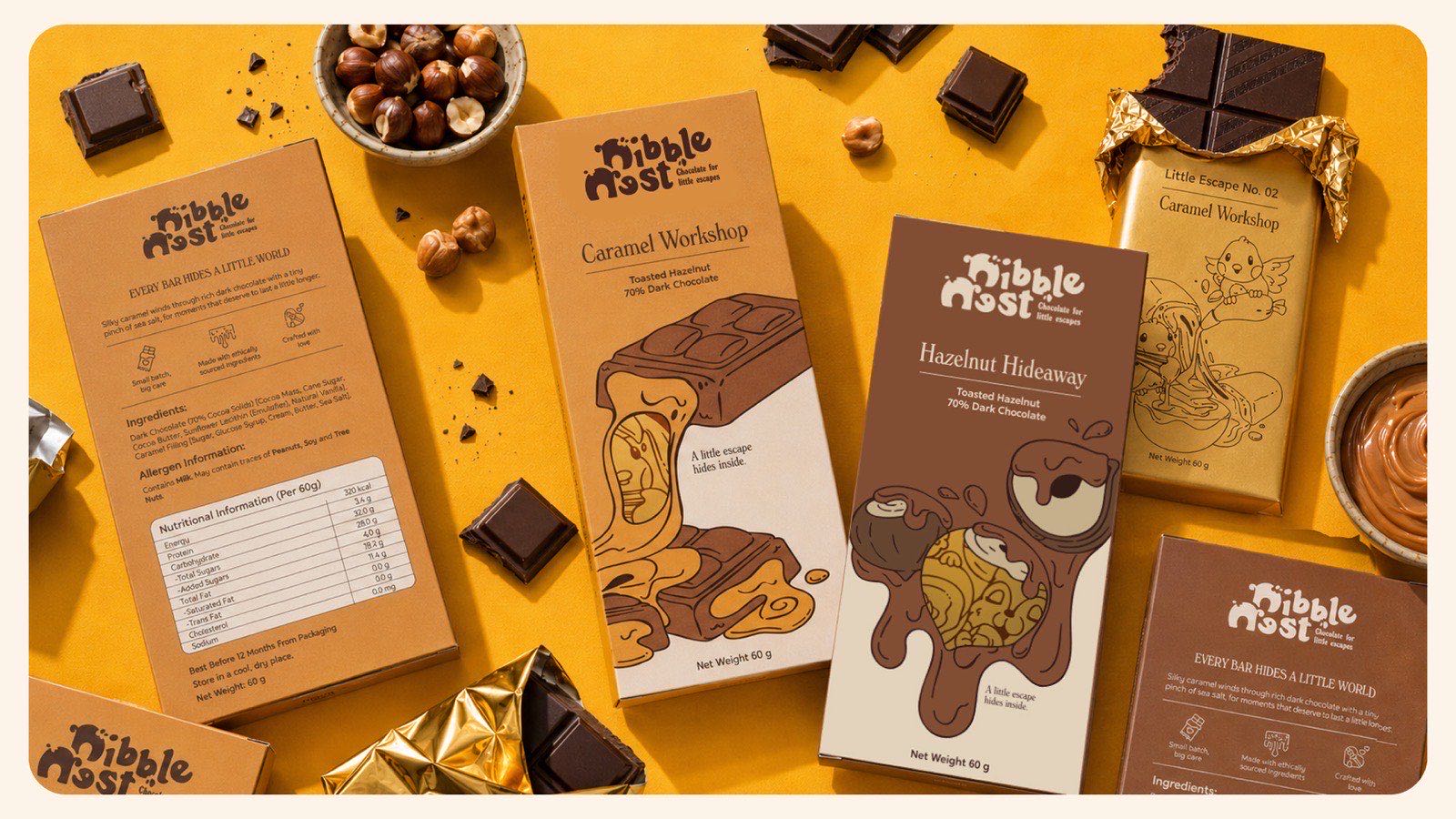
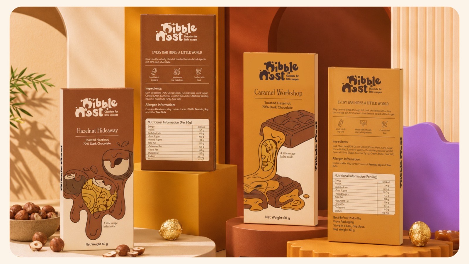
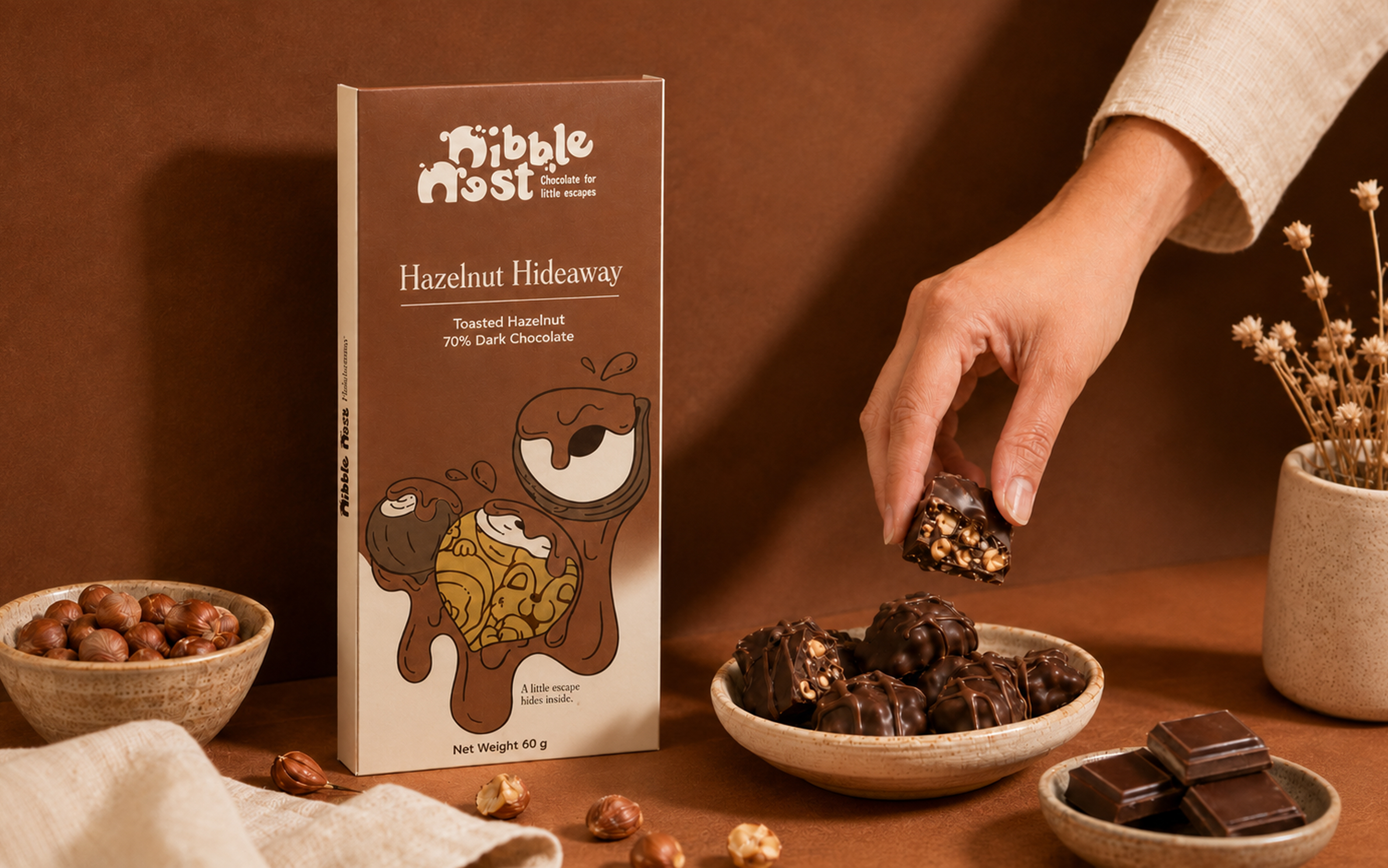
Nibble Nest is a chocolate brand we invented so we could design one end to end — illustration first, finished as press-ready cartons and foil wrappers.
SectorConfectionery · concept brand
EngagementSelf-initiated
ScopeIdentity, illustration, packaging artwork
OutputTwo SKUs, press-ready
A brand of our own, made to be finished rather than pitched — which is why the artwork below includes the ingredient panels and cut rules a real print run needs.
The brief
Make a bar worth keeping after the chocolate is gone.
Nibble Nest is a cosy chocolate brand built around the idea that every bar can feel like a tiny escape. Each flavour gets its own little world: ingredient-focused artwork, a collectible inner wrapper, and a die-cut window on the carton that teases what is hiding inside.
The goal was to make the chocolate as good to discover as it is to eat. That put illustration first and treated the pack as the thing the drawing lives on, rather than adding a drawing to a pack that had already been laid out.
The constraint
A drawing that has to survive three surfaces.
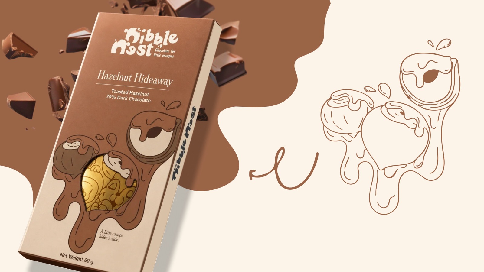
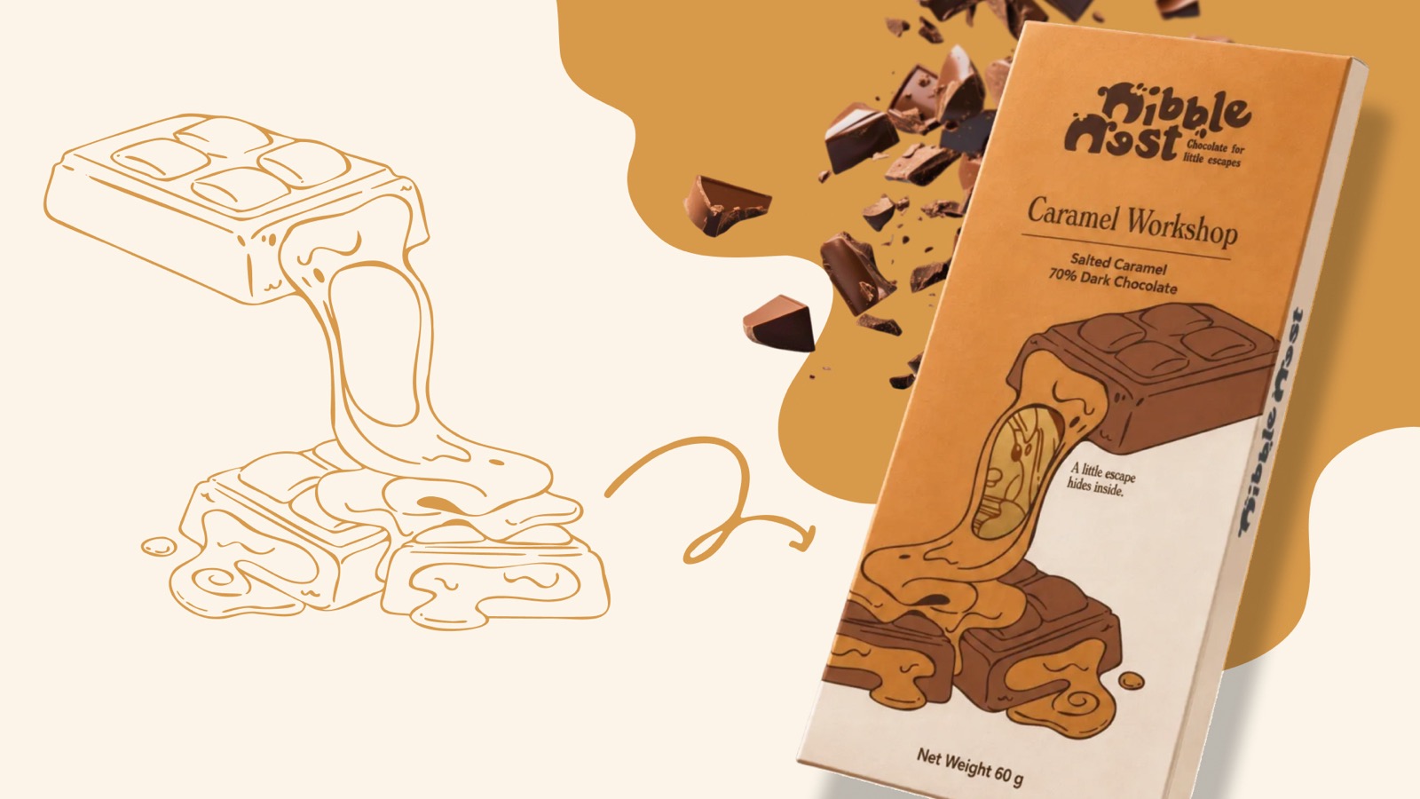
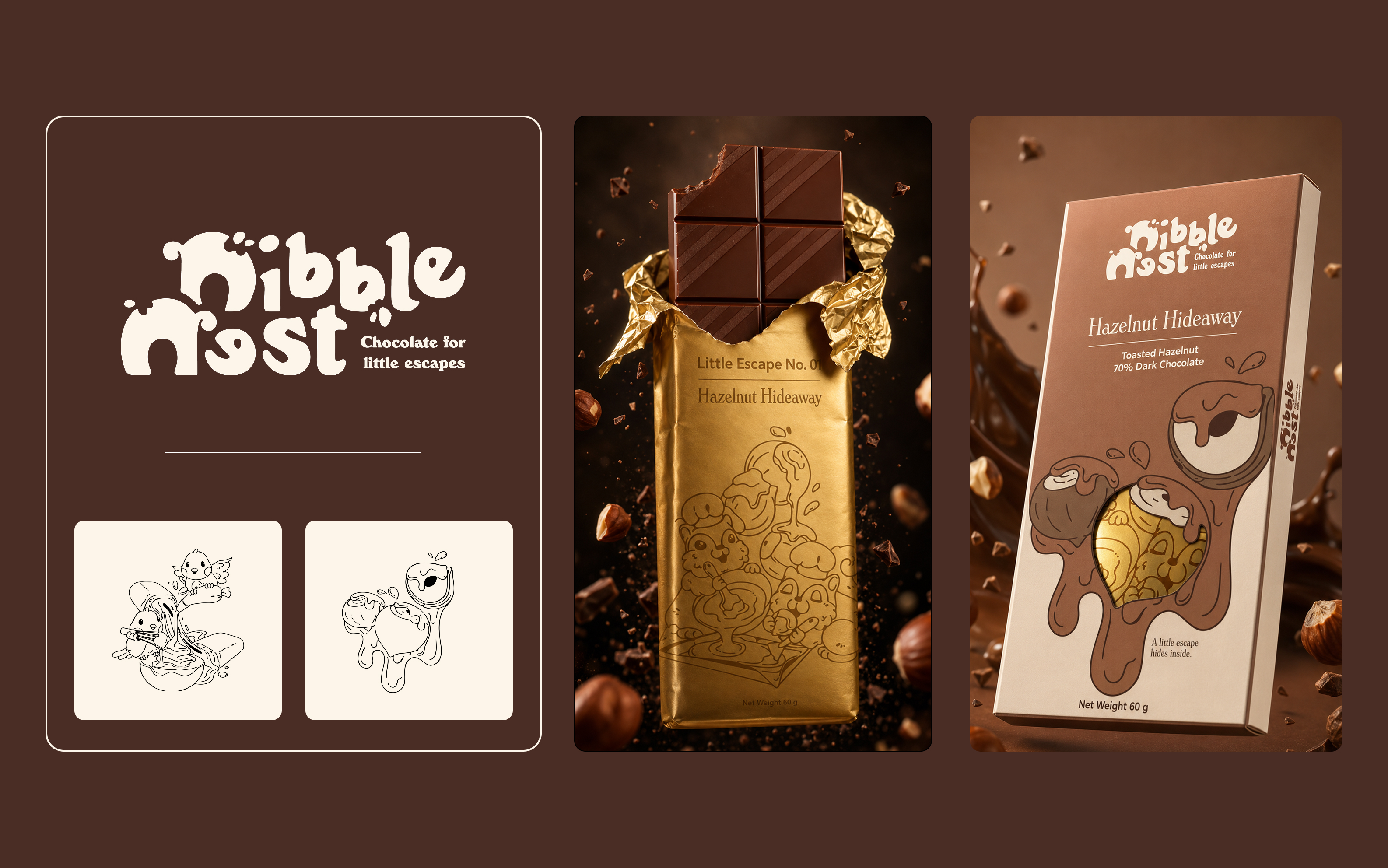
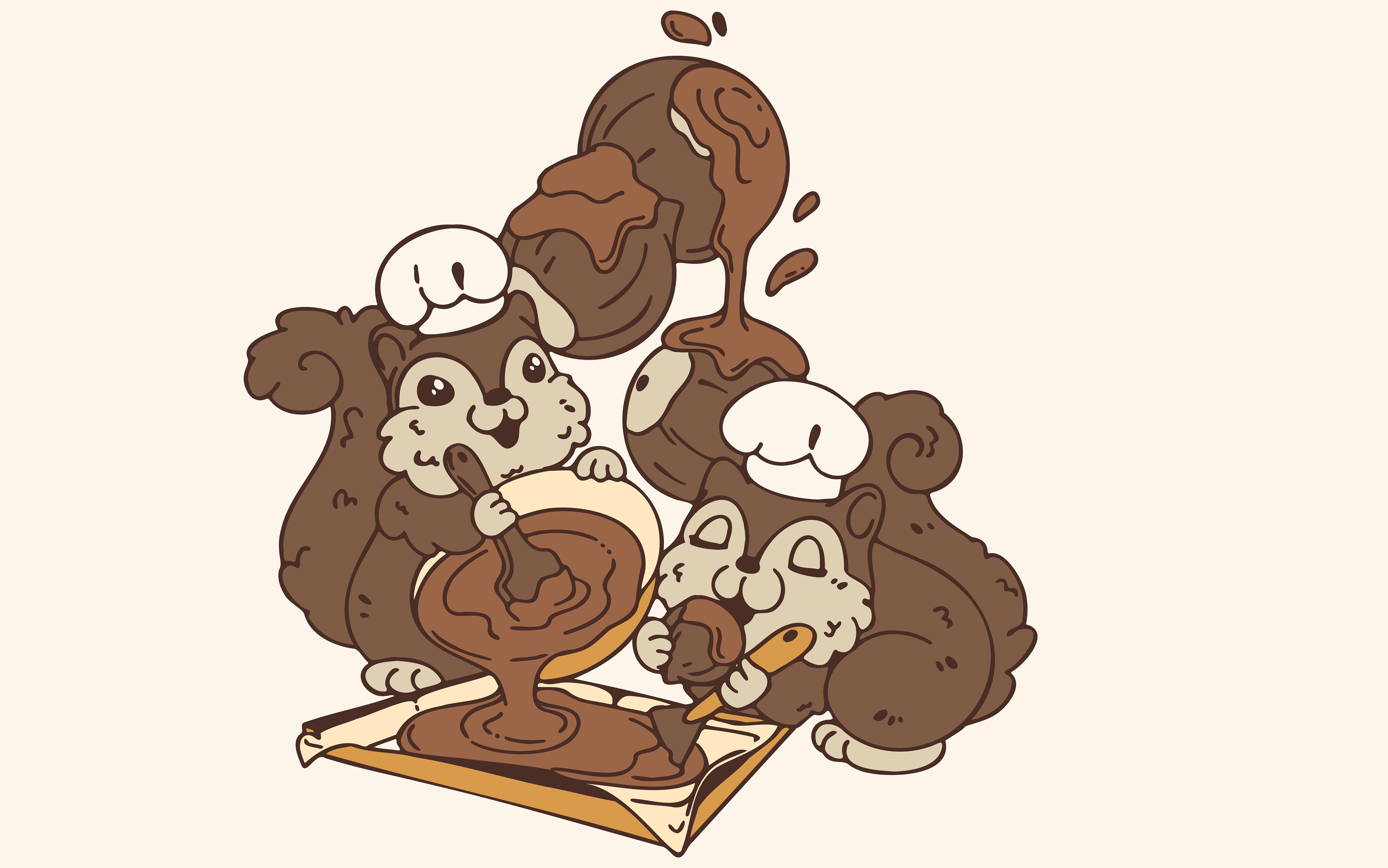
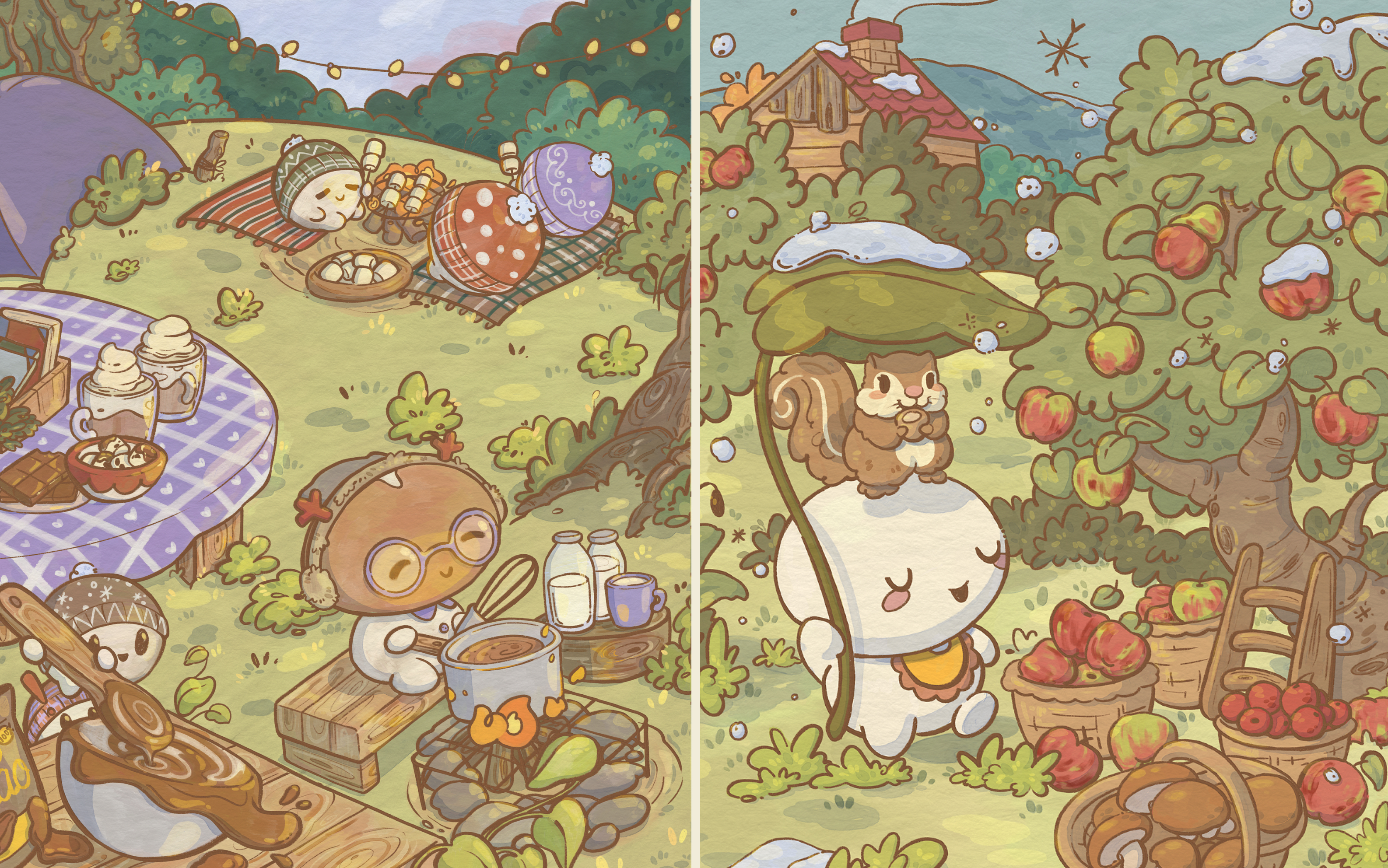
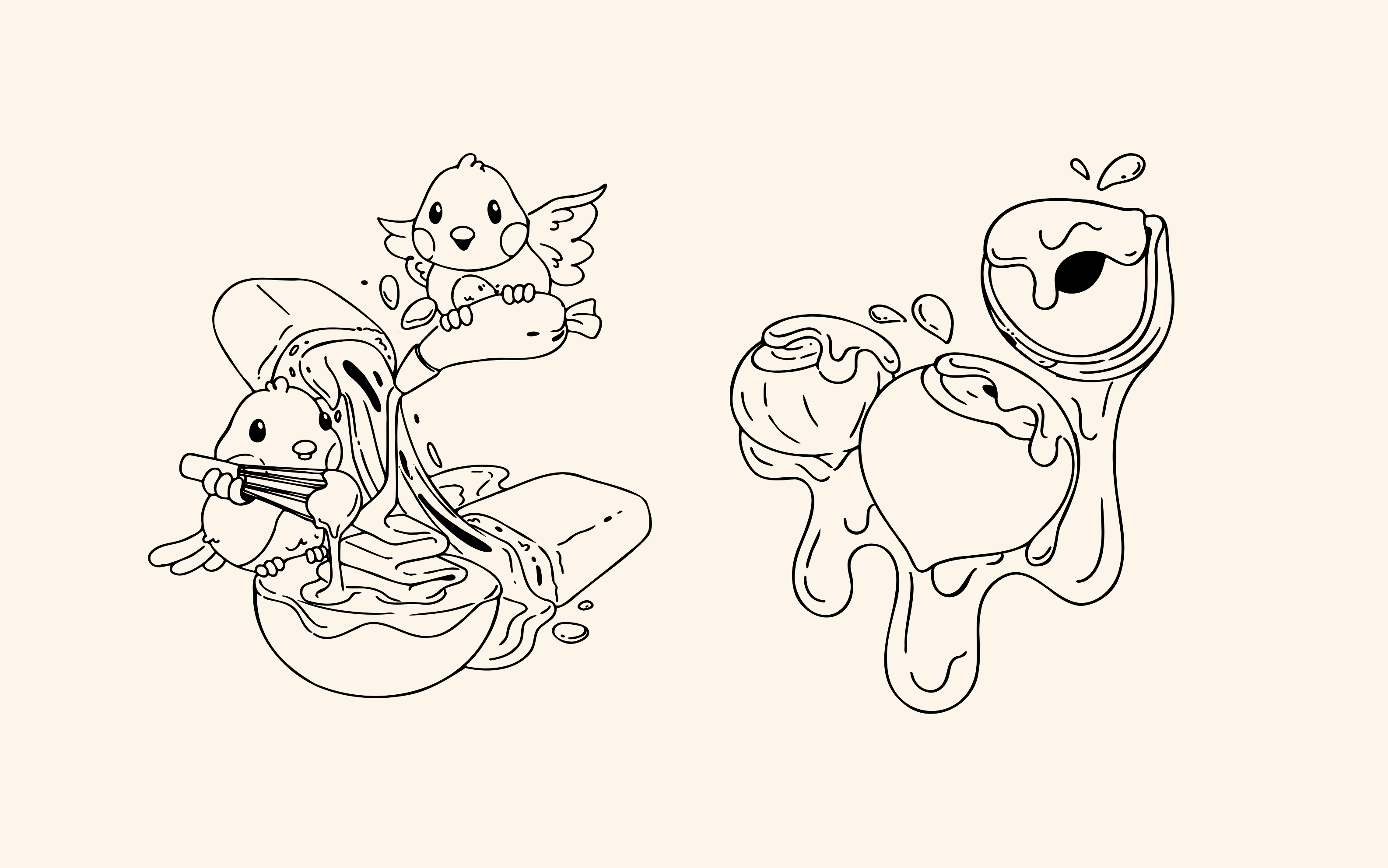
01One cast, three finishesThe same characters appear as flat line art on the carton, as a single-colour emboss on gold foil, and as fully painted scenes in campaign work. A style that only holds in one of those is a style that breaks at print.
02The window cuts the artworkA die-cut window removes part of the front panel, so the illustration has to be composed around a hole and still read once the hole is there.
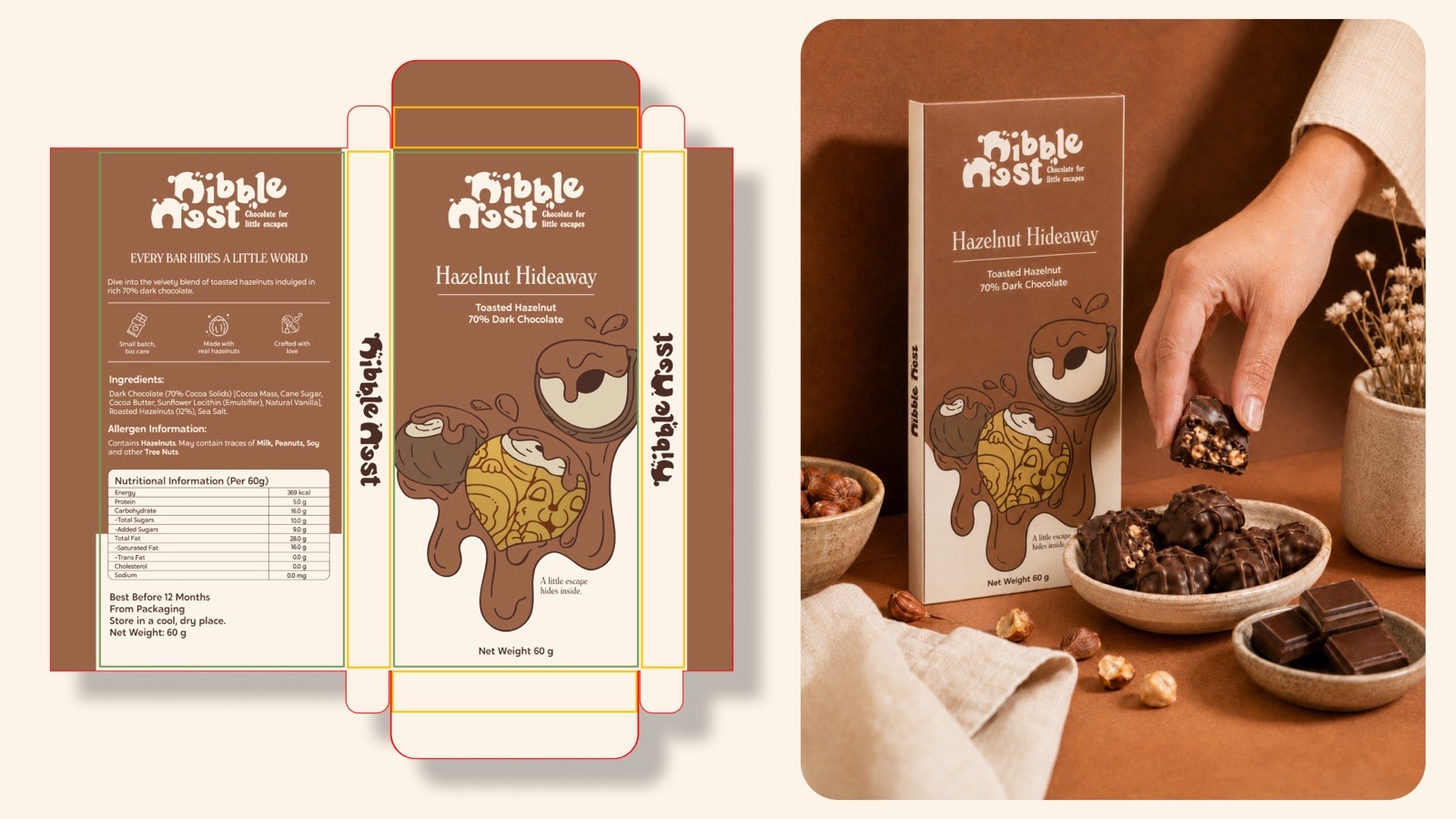
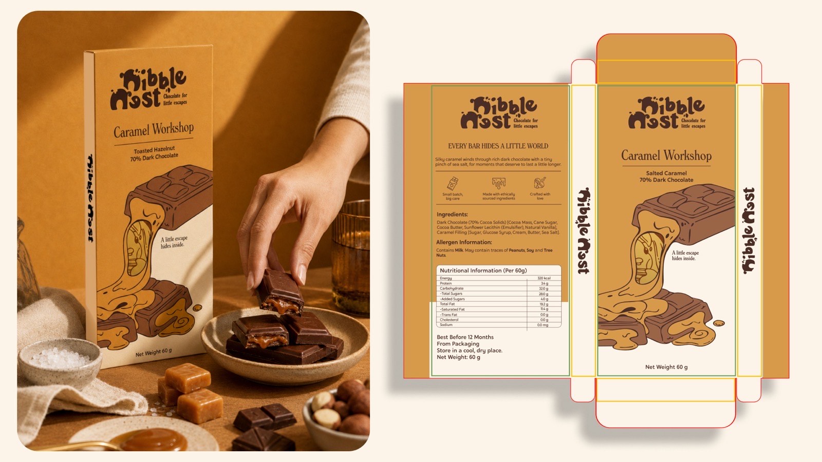
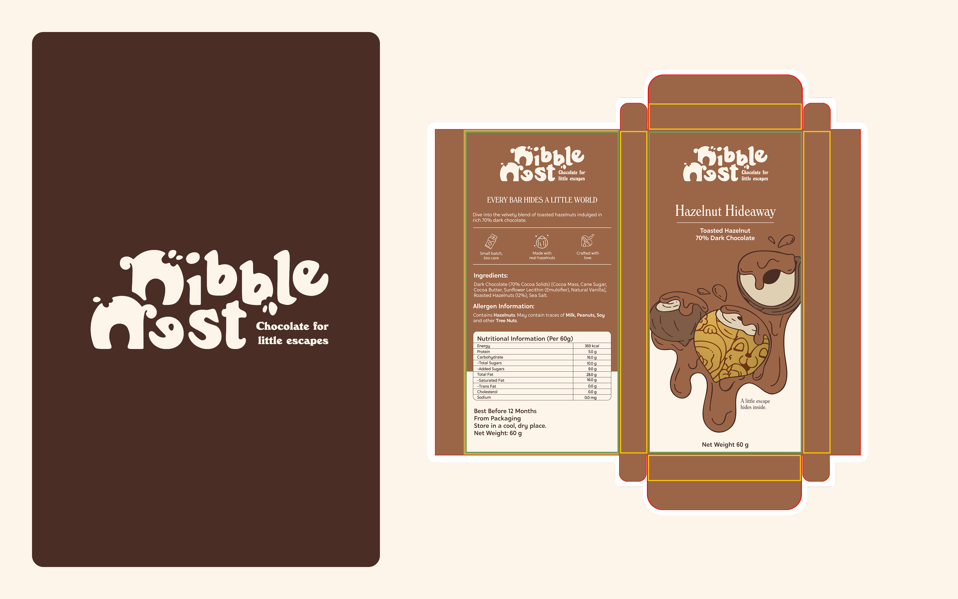
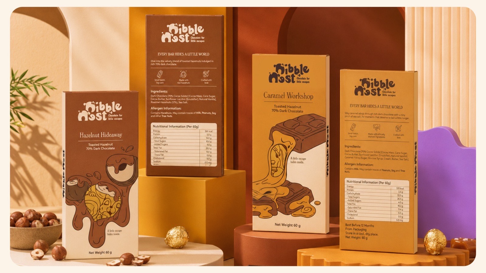
03Half the pack is regulatedIngredients, allergens, a nutrition table and storage lines are fixed content that cannot be cropped, shrunk or moved for the sake of the drawing.
What we built
An identity, then the artwork it prints as.
01
Wordmark and clear space
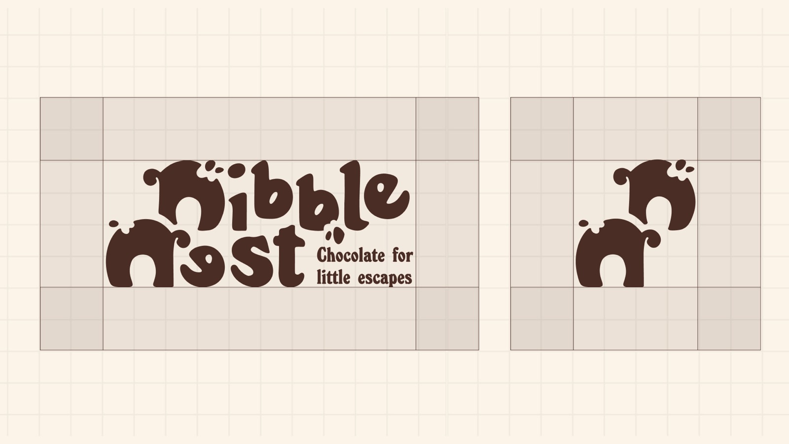
A bubbly wordmark and a standalone monogram, specified against a grid so the minimum clear space is measured in units of the mark rather than in millimetres nobody applies.
02
A line system per flavour
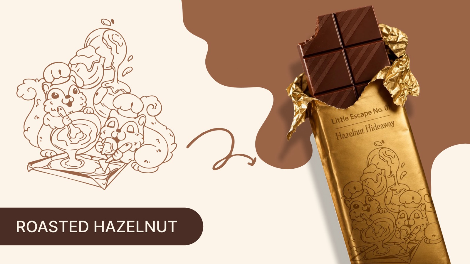
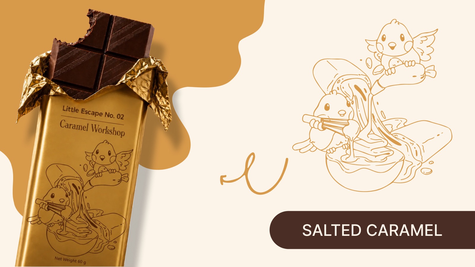
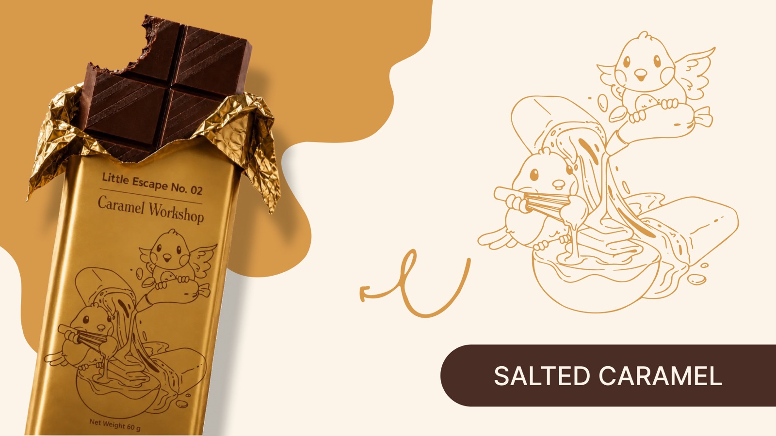
Single-weight, no fill, drawn so it survives being embossed into reflective foil and scaled down to sticker size — one little world per flavour, same hand throughout.
03
Press-ready cartons
Unfolded dielines with cut and bleed rules, every regulatory panel typeset, and the window cut planned into the artwork rather than punched through it afterwards.
The work
Identity, artwork, and the unglamorous half.
Lockup and monogram, specified against one grid.
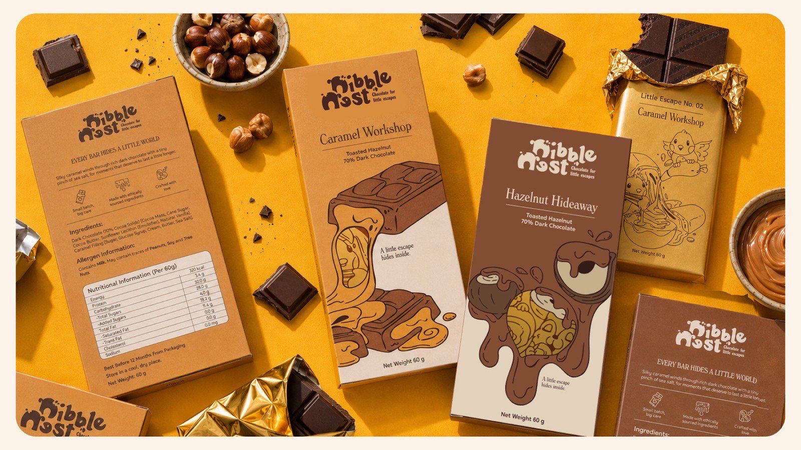
Hazelnut Hideaway — the drawing, and the foil it prints as.
Caramel Workshop — same hand, second little world.
The window is composed into the drawing, not punched through it.
Front panel and its source drawing, side by side.
Dieline and finished pack — the same artwork, before and after folding.
Every regulatory panel typeset before the pack is folded.
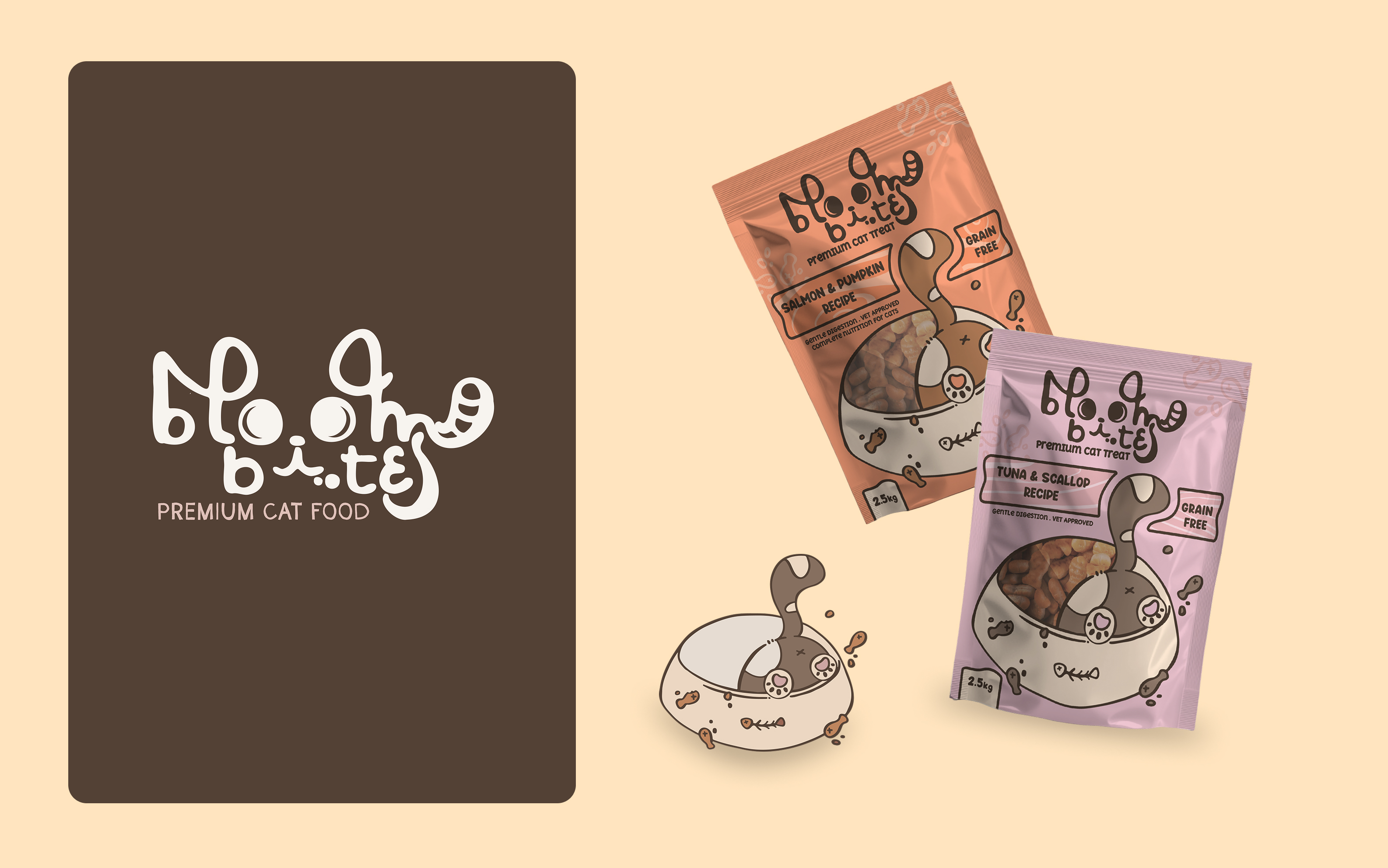
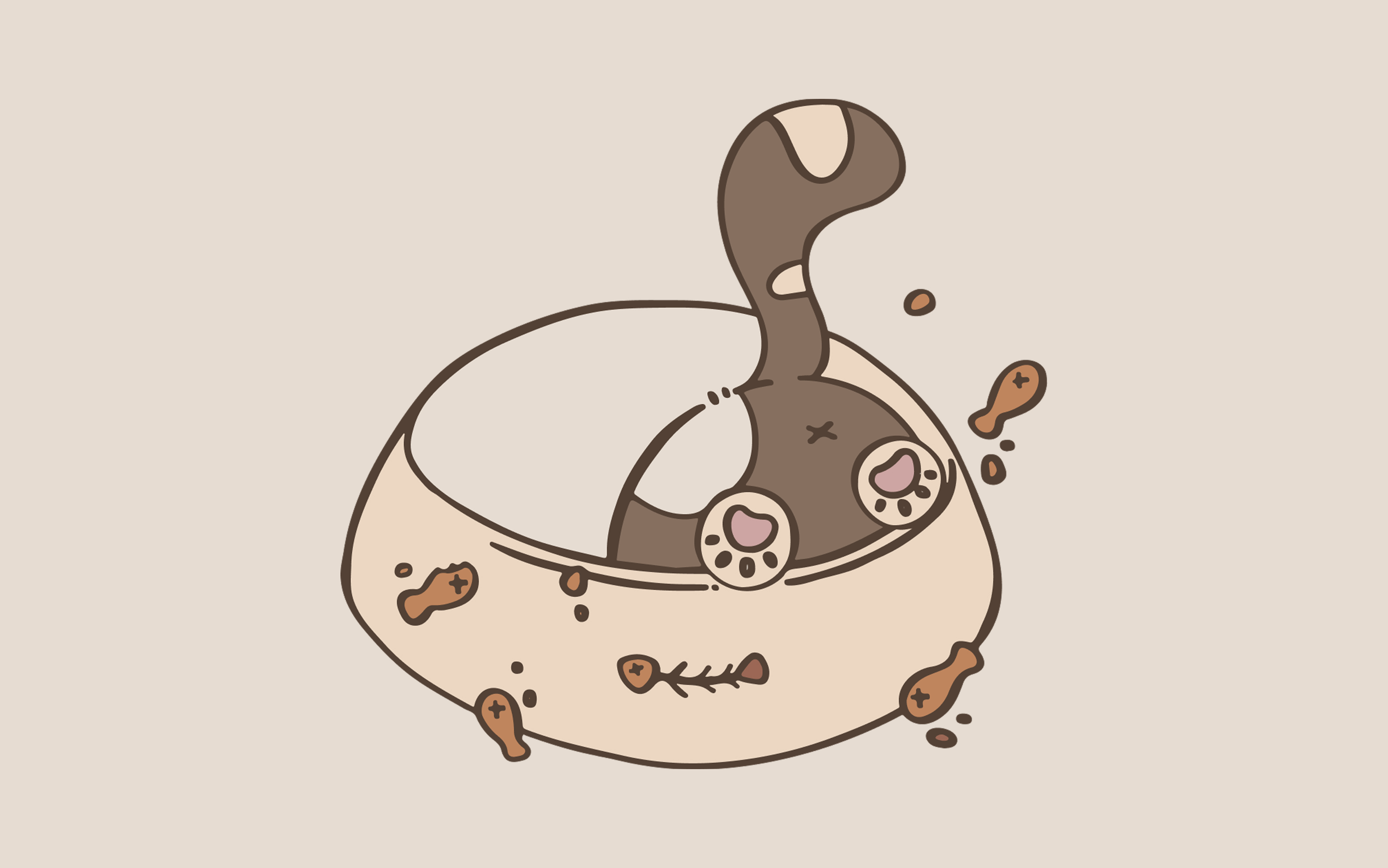
Bloom Bites reuses the method on a premium cat-food range: one drawn bowl recoloured per recipe rather than redrawn, on stand-up pouches instead of folding cartons. Both sit in the packaging and illustration grids, which is where the range of the style is easiest to judge.