Zasya MediazasyamediaStart a Project
Vertical 02 — Creative Design

Creative assets designedto supportevery campaign.

The visual layer around your product and your video — identity, campaign creatives, packaging, illustration and investor decks, each scoped on its own but built from one system so nothing looks borrowed.
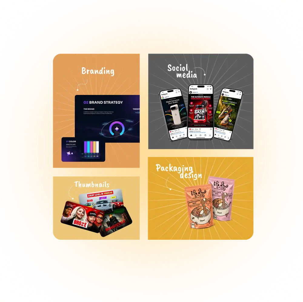
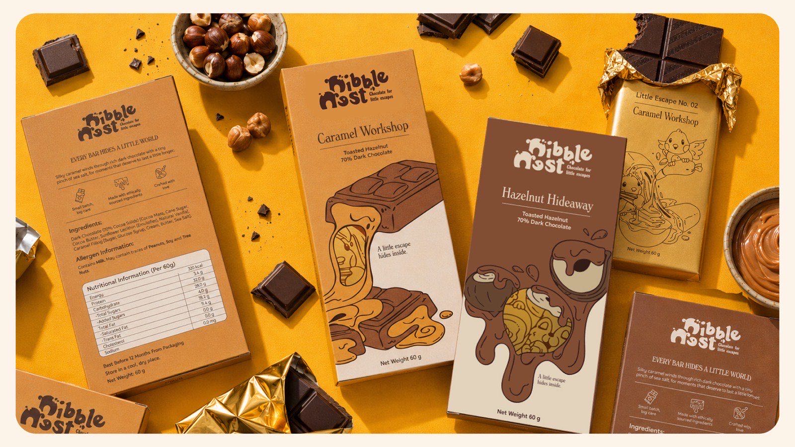
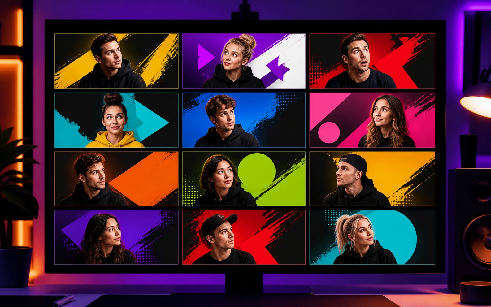
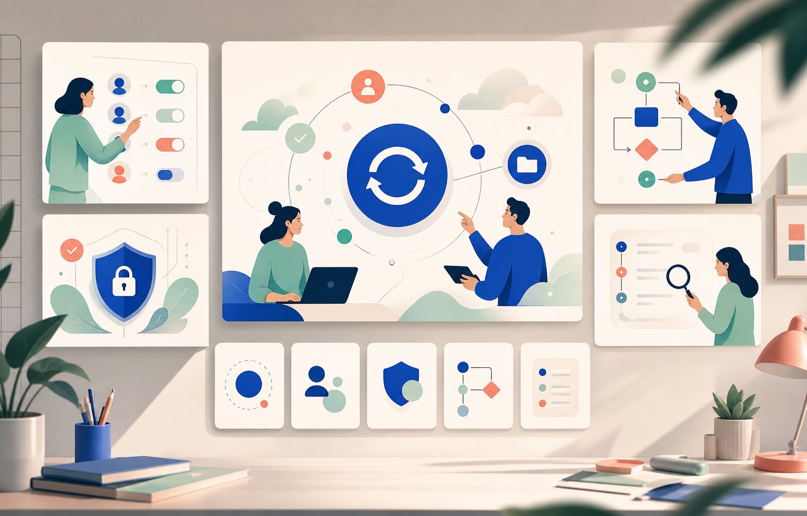
Four panels of design work — a brand strategy and colour deck, social media creatives on three phones, a set of YouTube thumbnails, and pet-food packaging artwork
What we design

From the mark on the box to the deck in the room.

Five services, each scoped and quoted on its own. Start anywhere — most brands begin with identity or campaign creatives and expand from there.

01

Brand Identity

The core system every other asset is built from — not a logo in isolation.

  • Logo design and variants
  • Colour and type systems
  • Brand guidelines
  • Asset libraries
See identity work
02

Marketing Creatives

Campaign assets sized and written for the channel they run on.

  • Social posts and ad sets
  • Thumbnail design
  • Landing page visuals
  • Email creatives
See campaign work
03

Packaging & Print

Physical artwork prepared to spec, with print-ready files and dielines.

  • Packaging artwork
  • Labels and inserts
  • Brochures and flyers
  • Print production files
See packaging work
04

Illustration

Drawn assets for the ideas a photograph cannot hold — pack artwork, product art, mascots and icon systems, built so your team can extend them.

  • Packaging illustration
  • Product illustration
  • Character and mascot design
  • Icon and vector systems
See illustration work
05

Presentation Design

Investor and sales decks built as an argument first — structure, then slides.

  • Investor and fundraise decks
  • Pitch and sales decks
  • Data and chart design
  • Reusable slide templates
See deck work
Selected design work

Systems, not one-offs.

Nibble Nest still
Branding · Packaging · IllustrationNibble Nest — illustrated chocolate packagingSelf-initiated · two SKUs
Thumbnail set still
MarketingThumbnail system for a weekly channelCreator · ongoing
Illustration still
IllustrationIllustration set for a product siteSaaS · web and docs
Deck still
PresentationsInvestor deck design and buildStartup · fundraise
Thumbnails and channel art

A template system, delivered with the video

All 7 examples
A composed man in a cardigan stands centre-frame holding a phone running Flappy Bird, with green pipes, a pixel bird and falling banknotes around him and “TOO SUCCESSFUL” in white and green caps.
Flappy Bird creator — template ASeries · YouTube
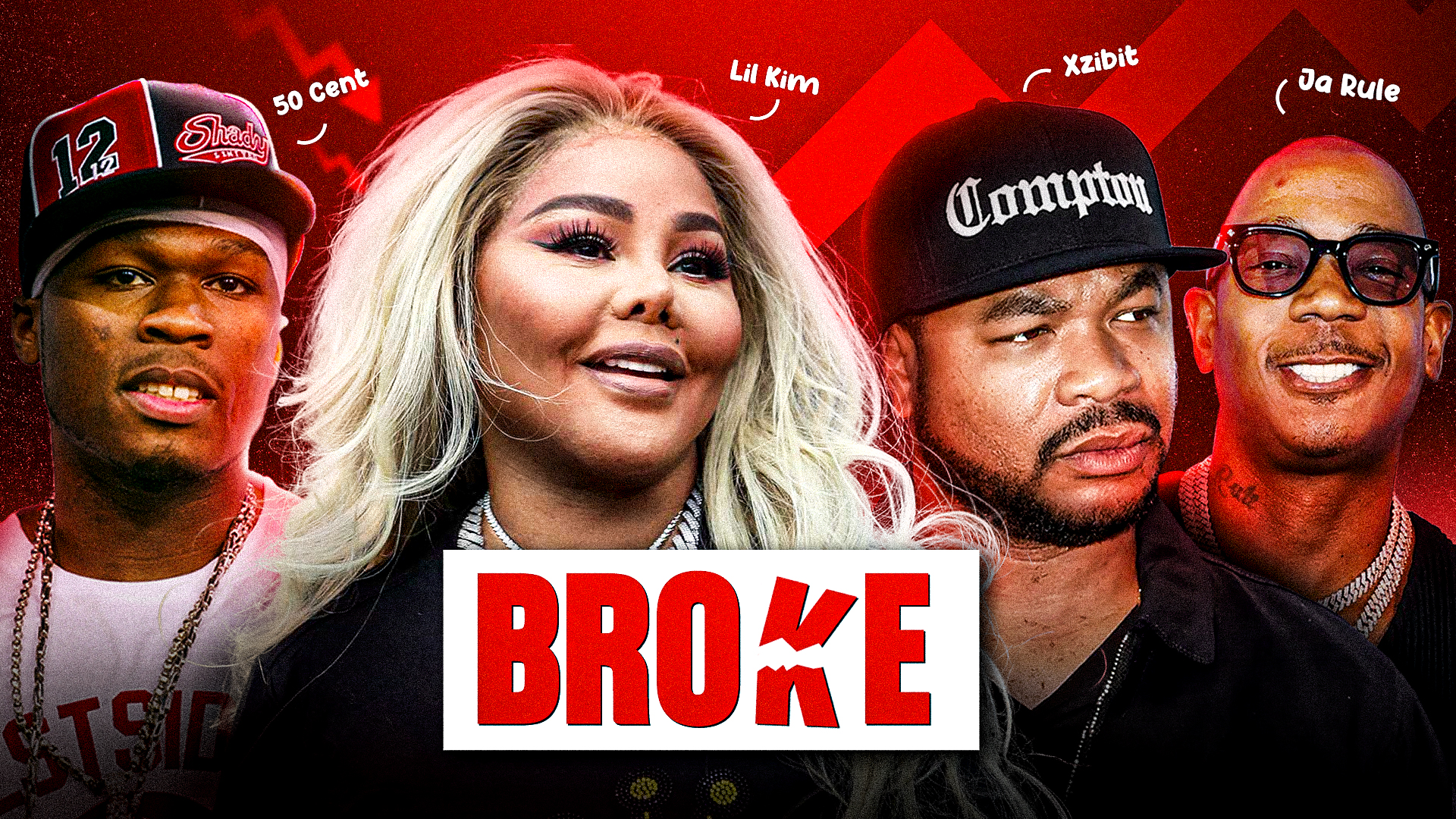
Four cut-out portraits across a red chevron background, each with a handwritten name label, and the word BROKE in a white box across the centre.
Four-guest panel — “Broke”Series · YouTube
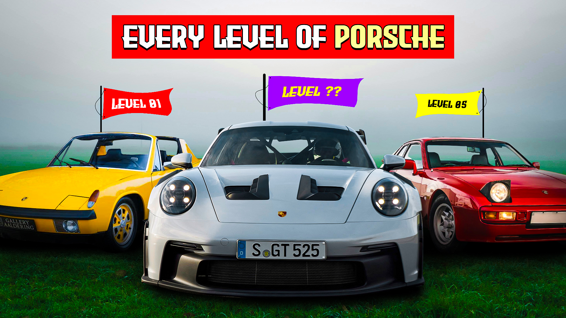
Three Porsches nose-on in fog on wet grass — a yellow 914, a white GT3 and a red 944 — under hand-drawn flags reading LEVEL 01, LEVEL ?? and LEVEL 05.
Porsche generations — level flagsSingle · YouTube
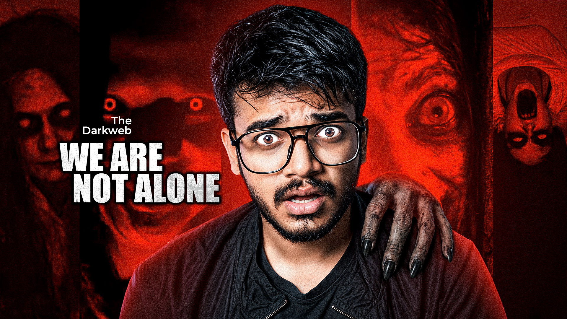
A wide-eyed presenter in glasses has a clawed grey hand on his shoulder, red-washed horror faces filling the panels behind him and “The Darkweb / WE ARE NOT ALONE” set at the left.
Dark web horror — red keySeries · YouTube
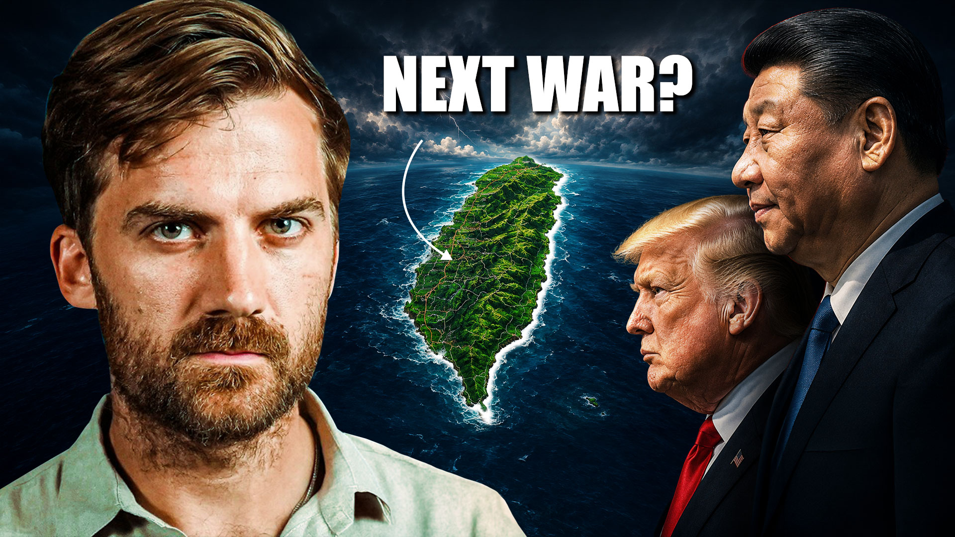
A grim presenter at the left, a satellite view of Taiwan under storm clouds at the centre, and two heads of state in profile at the right beneath the words NEXT WAR?
Taiwan flashpoint coverSingle · YouTube
Two interview guests cut out on a pale grid-paper background with a gold coin motif between them and “MOST INVESTORS ARE AVERAGE” set in black and torn-paper blue.
Two-guest split — grid groundSeries · YouTube
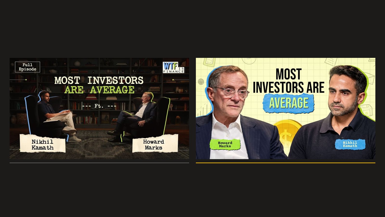
Two covers for one interview shown side by side: a dark library two-shot at the left, and a bright grid-paper cut-out treatment at the right, both carrying the same title.
A/B pair — same episode, two groundsPair · YouTube
More on requestTell us your format and we’ll send the closest examples we have.
Not published publiclyMost client work sits under NDA
Brand identity

One mark, one type system, and the templates after handover
All 9 examples
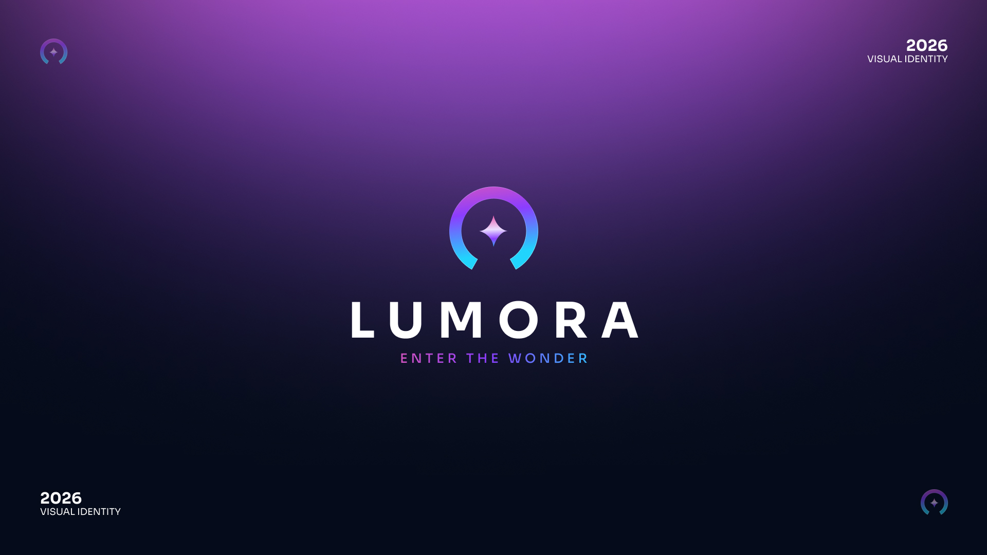
A gradient arc-and-star monogram sits above the LUMORA wordmark and the line ENTER THE WONDER, centred on a deep purple-to-navy field.
LUMORA — primary lockupIn-house demo · Identity
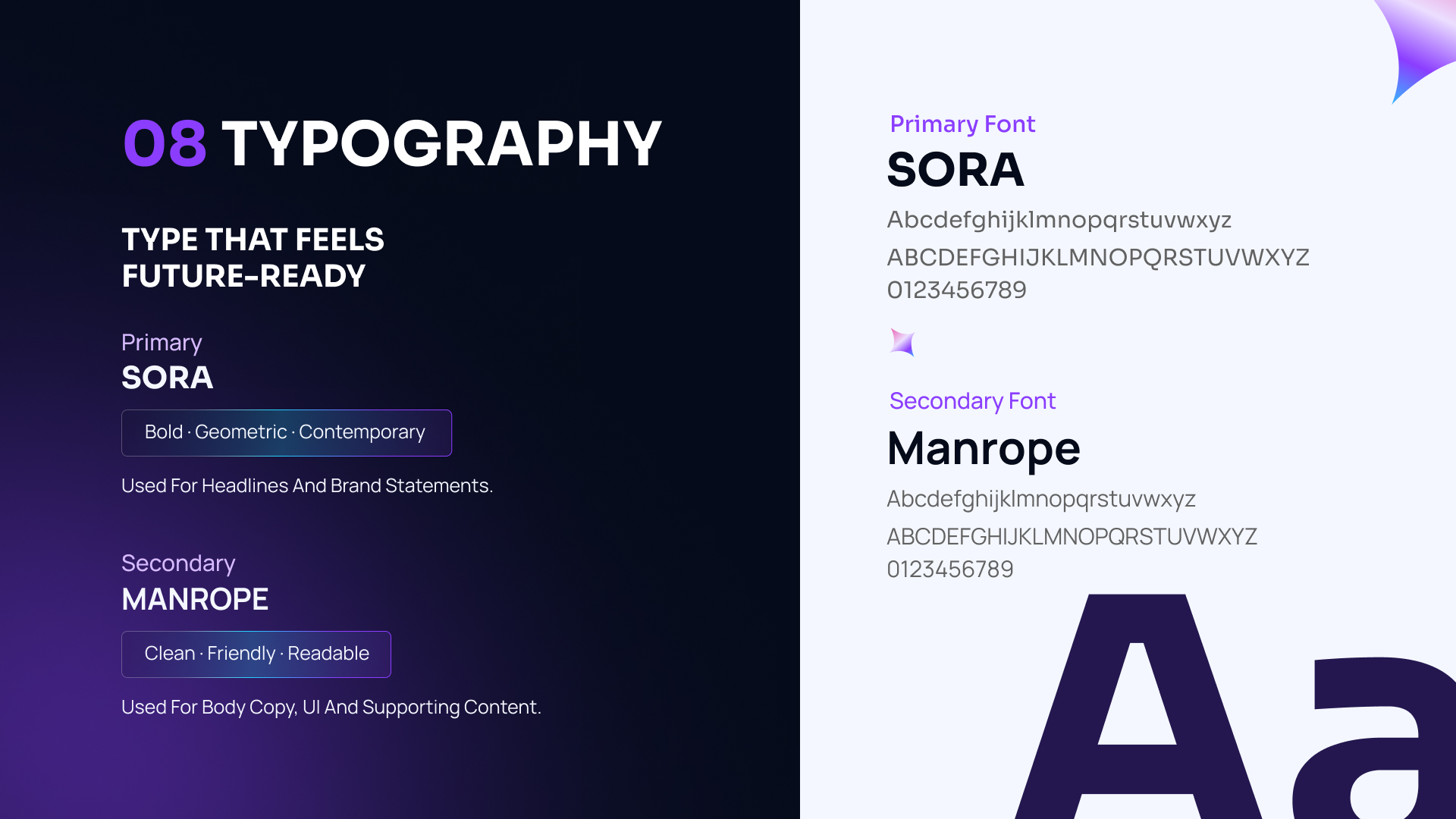
A split dark and light board pairing Sora for headlines with Manrope for body copy, each shown with full upper and lowercase alphabets and numerals.
LUMORA — typographyIn-house demo · Two families
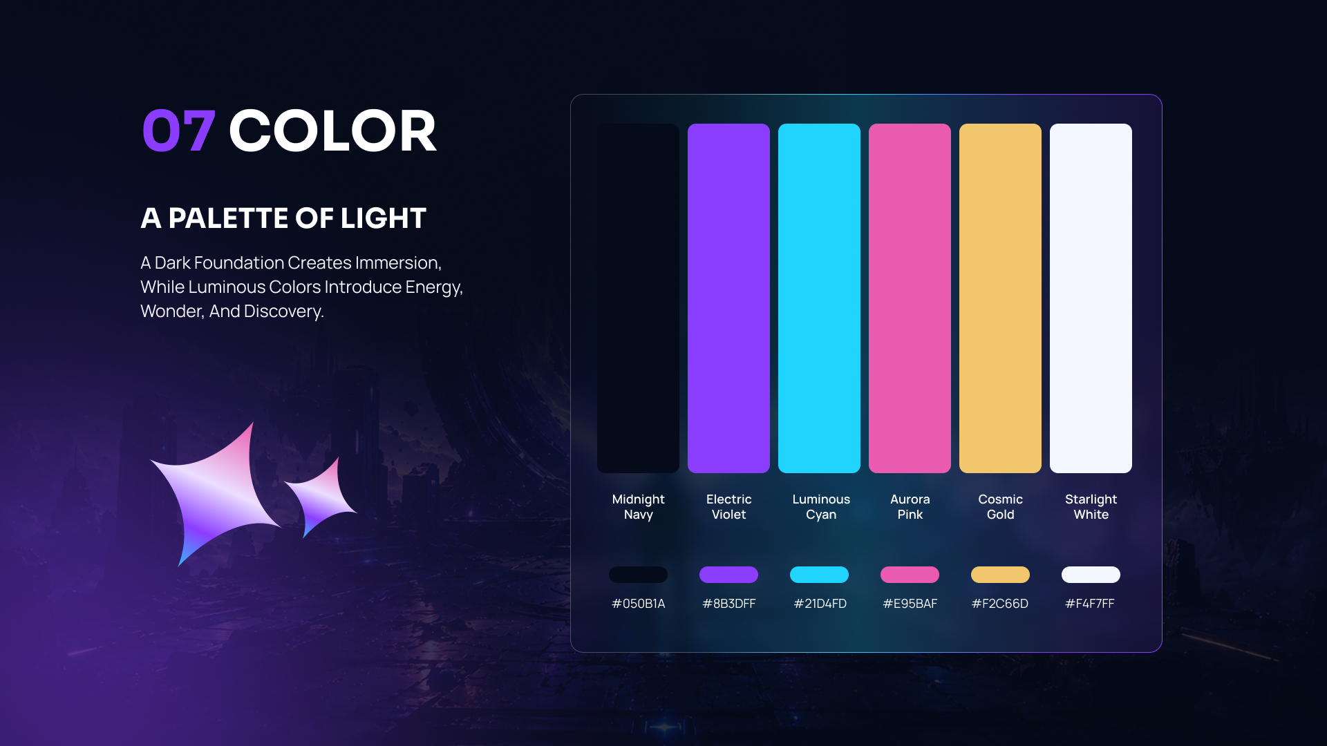
Six vertical swatches named Midnight Navy, Electric Violet, Luminous Cyan, Aurora Pink, Cosmic Gold and Starlight White, each captioned with its hex value.
LUMORA — colourIn-house demo · Six swatches
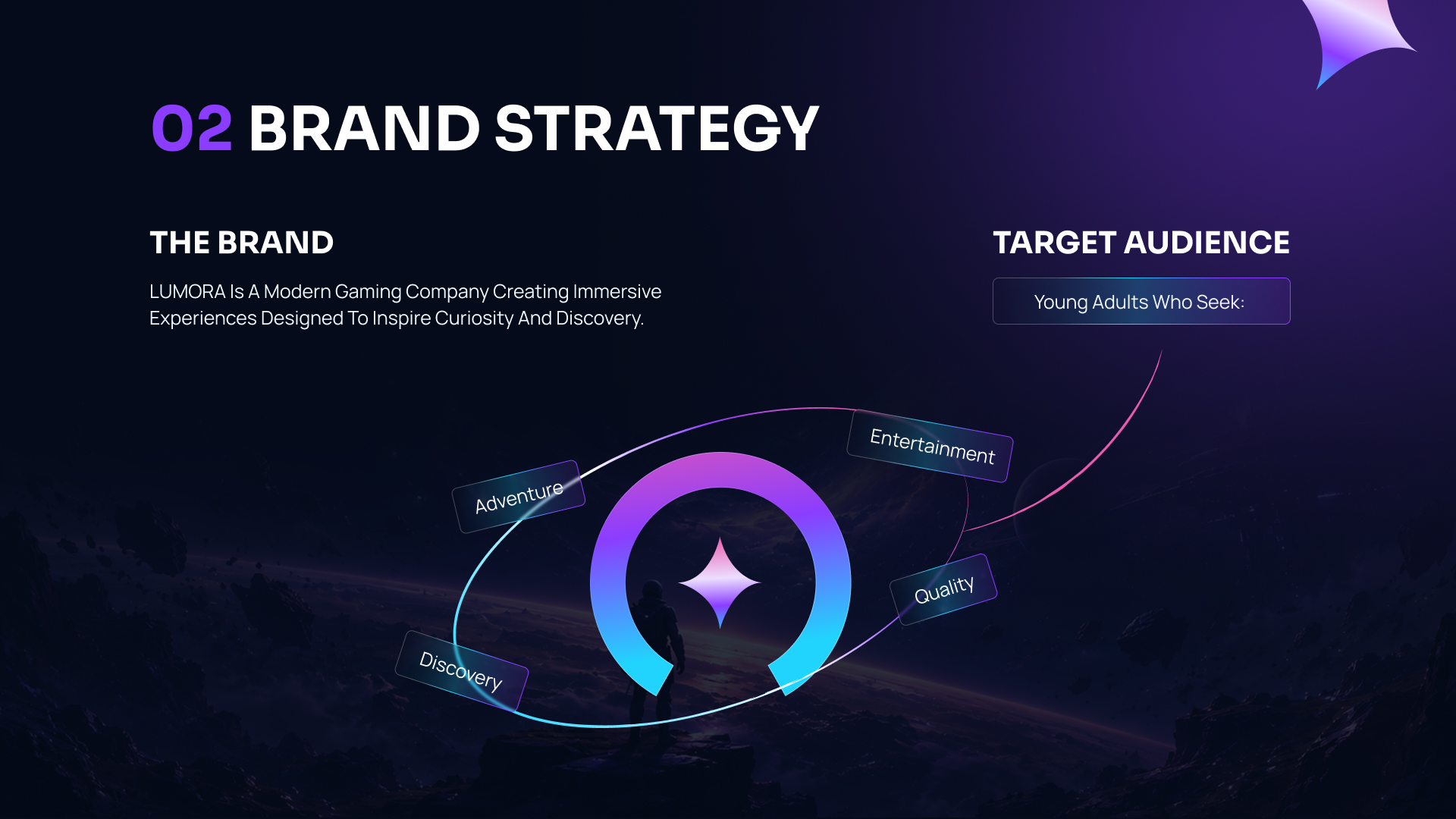
A spread headed “02 Brand strategy”, with a positioning paragraph at the left and four audience attributes orbiting the monogram over a planetary landscape.
LUMORA — brand strategy spreadIn-house demo · Guidelines
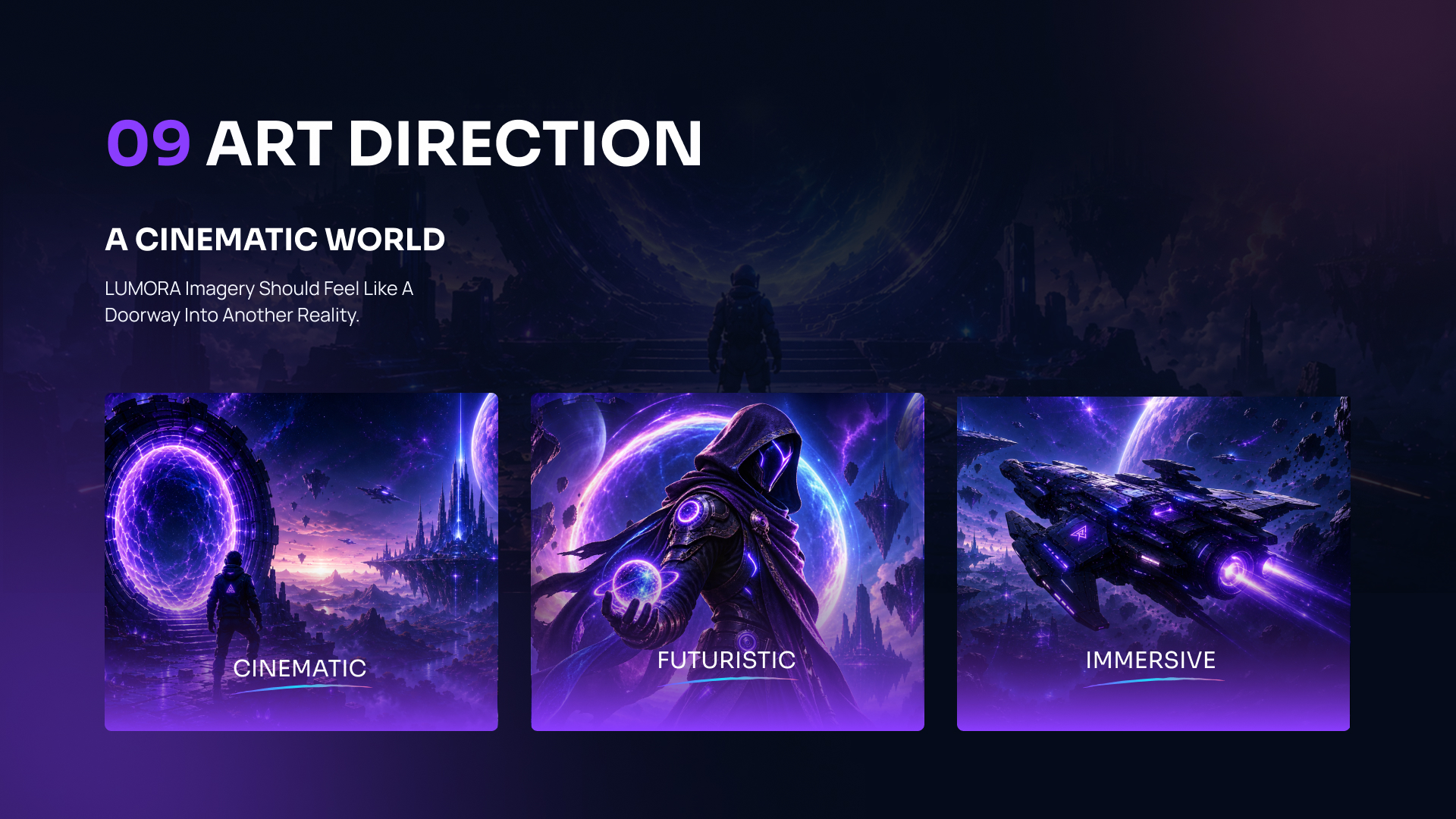
A spread headed “09 Art direction” showing three key-art cards labelled CINEMATIC, FUTURISTIC and IMMERSIVE against a purple space scene.
LUMORA — art directionIn-house demo · Imagery
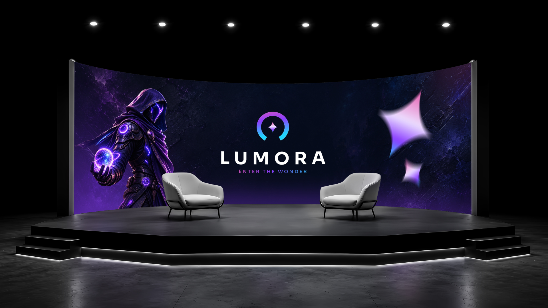
A curved LED stage wall carries the LUMORA lockup and key art, with two white armchairs on a black riser under a row of downlights.
LUMORA — stage buildIn-house demo · Environment
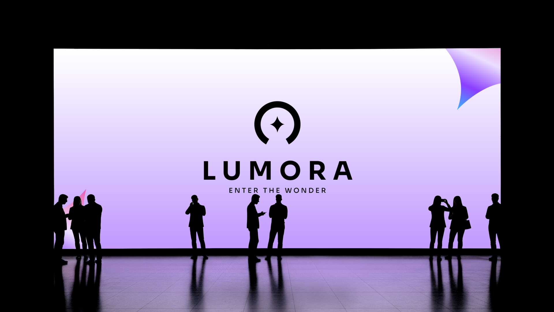
A wide lilac-to-white LED wall shows the LUMORA mark in solid black, with visitors silhouetted along its base.
LUMORA — light-ground wallIn-house demo · Environment
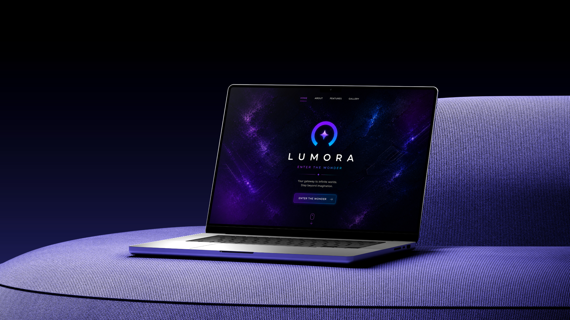
A laptop on a blue upholstered bench displays the LUMORA home page — nebula ground, centred lockup and an ENTER THE WONDER button.
LUMORA — site landingIn-house demo · Web
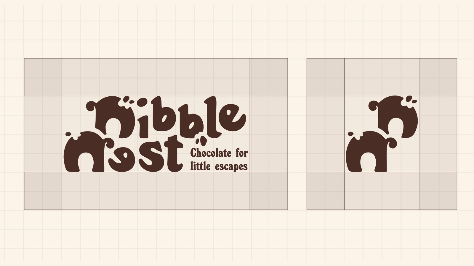
Two panels on a cream grid: the full Nibble Nest lockup with its “chocolate for little escapes” descriptor at the left, and the standalone monogram at the right, each boxed by its clearspace margin.
Nibble Nest — wordmark and clearspaceConfectionery · Identity
More on requestTell us your format and we’ll send the closest examples we have.
Not published publiclyMost client work sits under NDA

For a single job followed from first drawing to press-ready carton, read the Nibble Nest packaging case study.

Packaging and print

Artwork prepared to spec, dielines included
All 6 examples
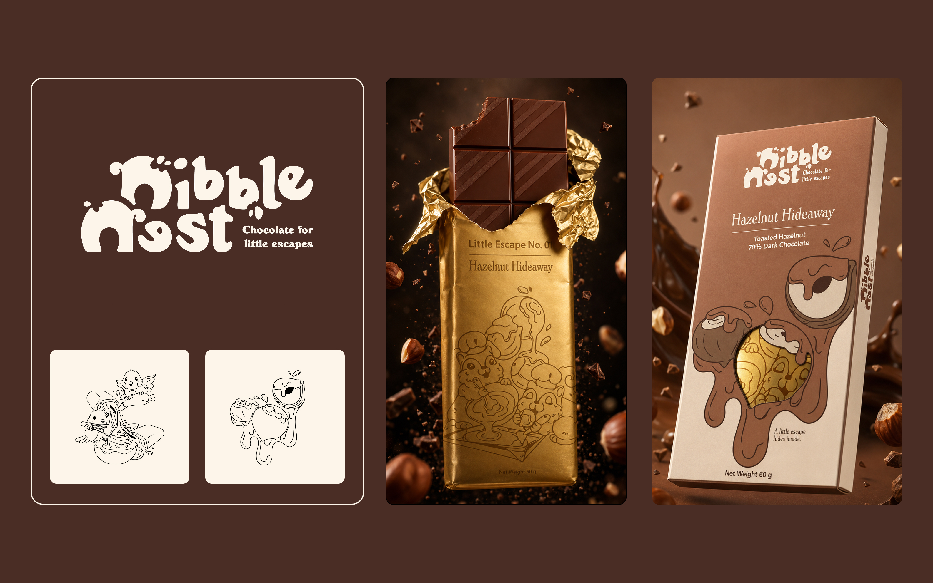
A three-panel board for Nibble Nest chocolate: the bubbly wordmark at the left, a gold foil bar half-unwrapped at the centre, and the Hazelnut Hideaway carton in a chocolate splash at the right.
Nibble Nest — brand and cartonConfectionery · Print
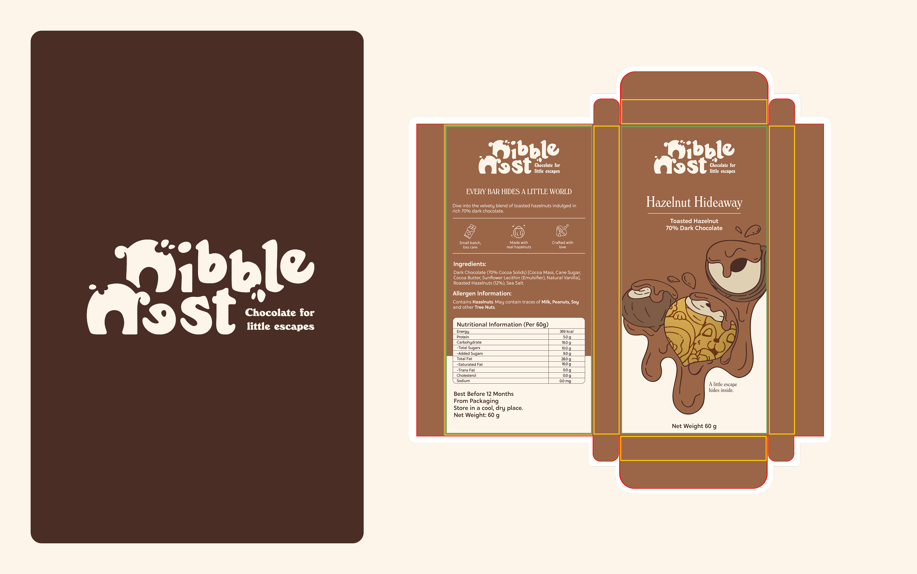
The Nibble Nest logo on a dark panel beside an unfolded carton dieline with cut and bleed rules, ingredients, allergen warnings and a nutrition table.
Nibble Nest — flat and dielinePrint · Press-ready
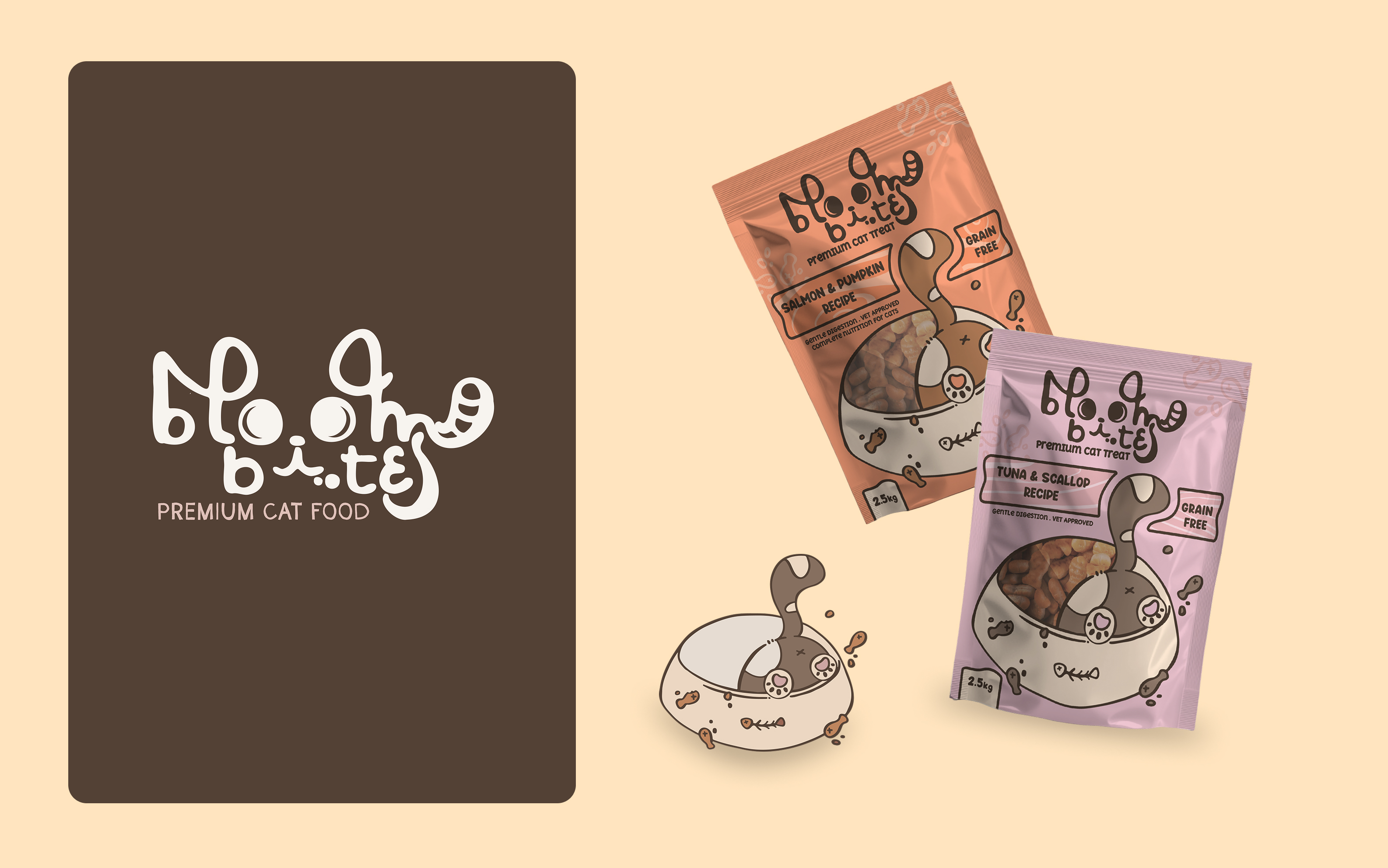
The Bloom Bites logo on a dark panel beside two stand-up pouches, Salmon & Pumpkin and Tuna & Scallop, each carrying a GRAIN FREE flash.
Bloom Bites — cat food rangePet · Pouches
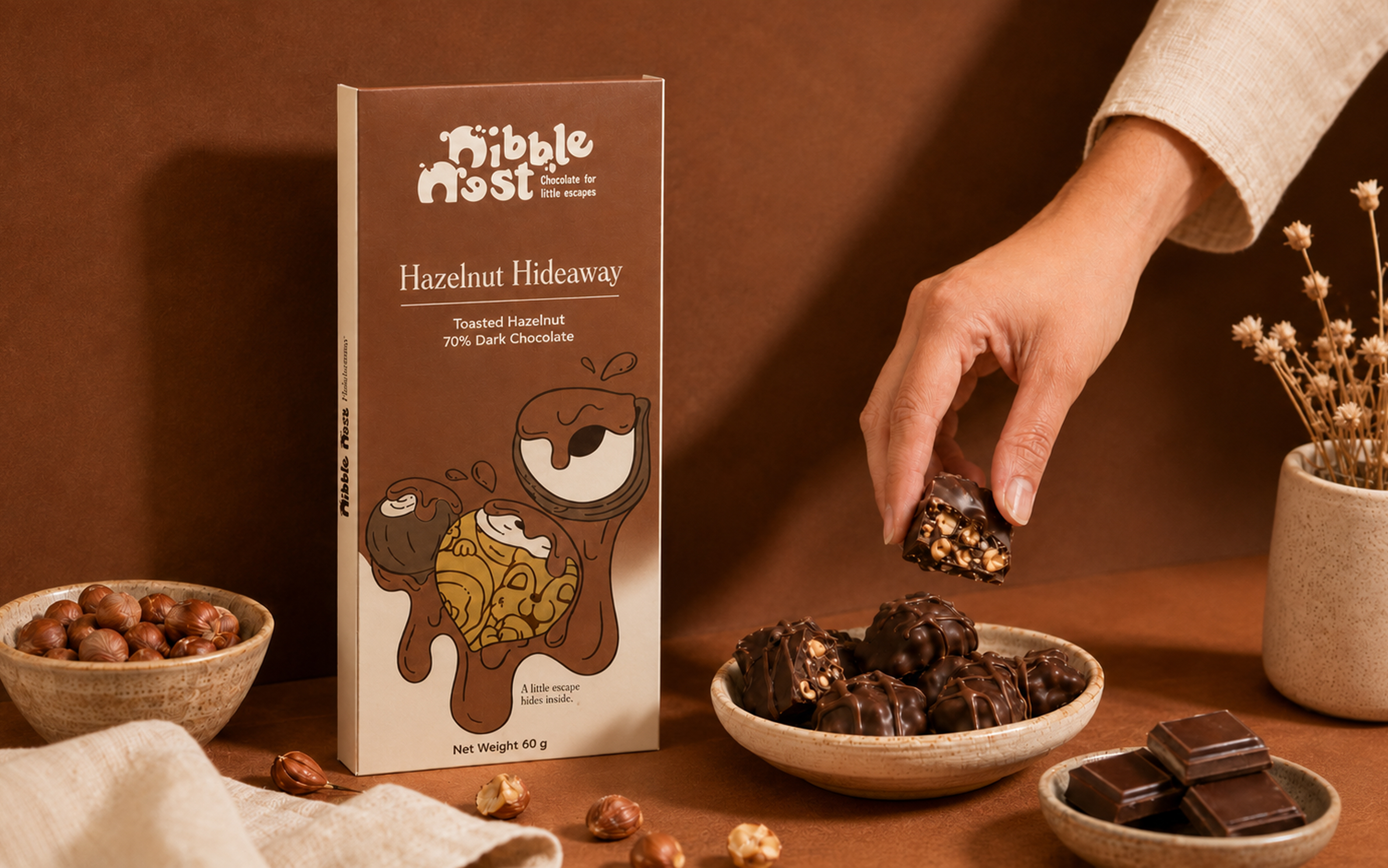
The Hazelnut Hideaway carton stands on a warm brown surface while a hand lifts a hazelnut chocolate from a dish, with bowls of nuts and a dried posy arranged around it.
Nibble Nest — styled shelf shotPresentation · Retail
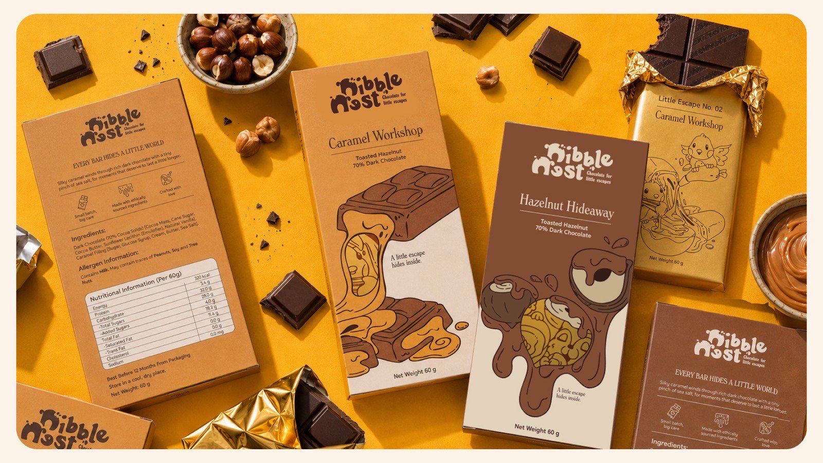
An overhead arrangement on a yellow ground: two chocolate cartons face up, a third turned to its nutrition panel, a half-unwrapped gold foil bar, a bowl of hazelnuts and a bowl of caramel.
Nibble Nest — full range flat-layConfectionery · Range
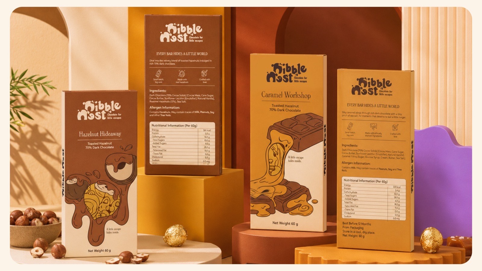
Four Nibble Nest cartons stand at different heights on cream, yellow and terracotta plinths against a warm backdrop, with hazelnuts and foil-wrapped chocolates at their base.
Nibble Nest — retail range shotConfectionery · Retail
More on requestTell us your format and we’ll send the closest examples we have.
Not published publiclyMost client work sits under NDA
Illustration

A line system your team can extend
All 7 examples
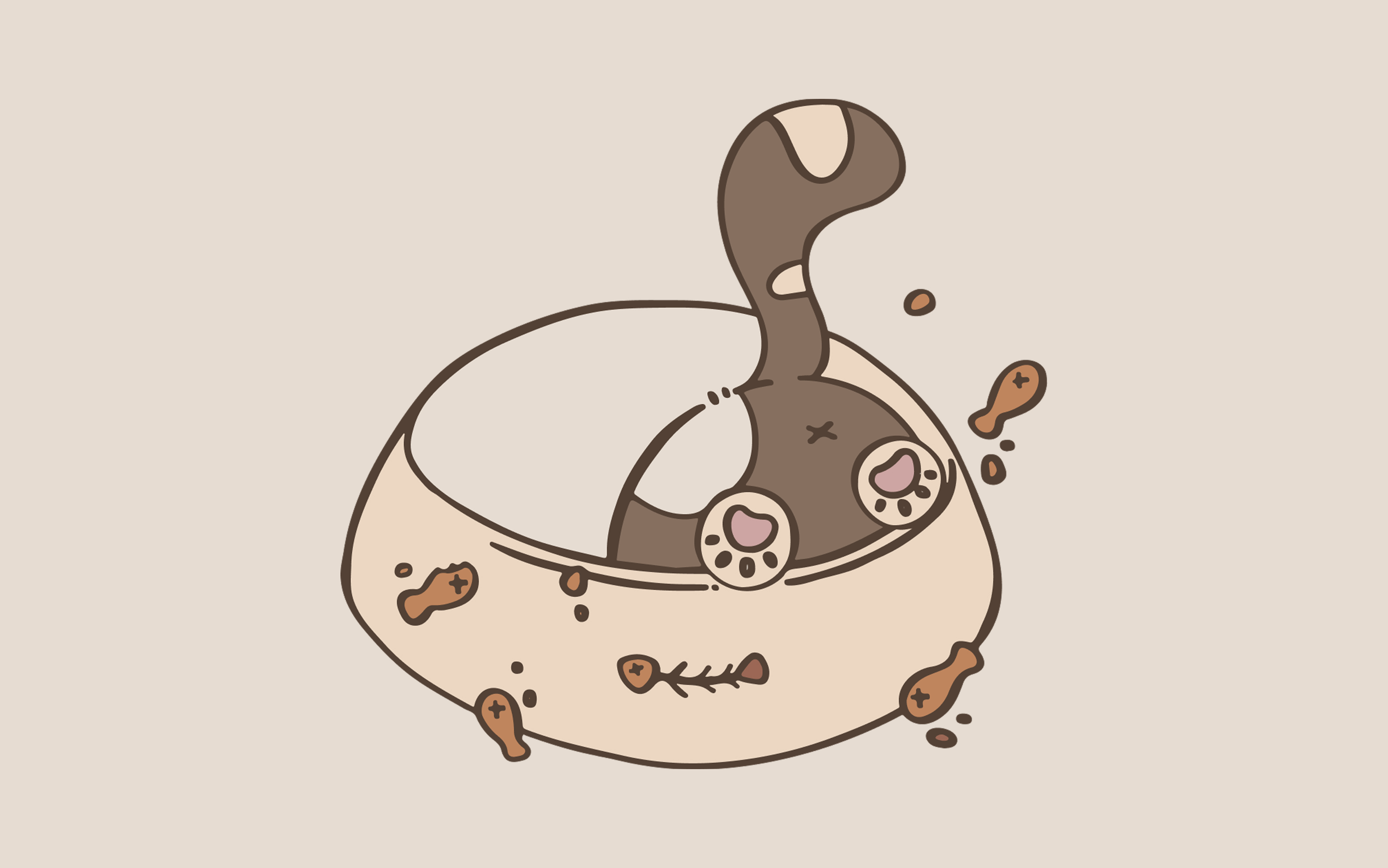
A line-drawn cat is submerged head-first in a feeding bowl with only its tail and two paw pads showing, kibble scattered across the rim.
Bloom Bites — pouch artworkPet food · Pouch art
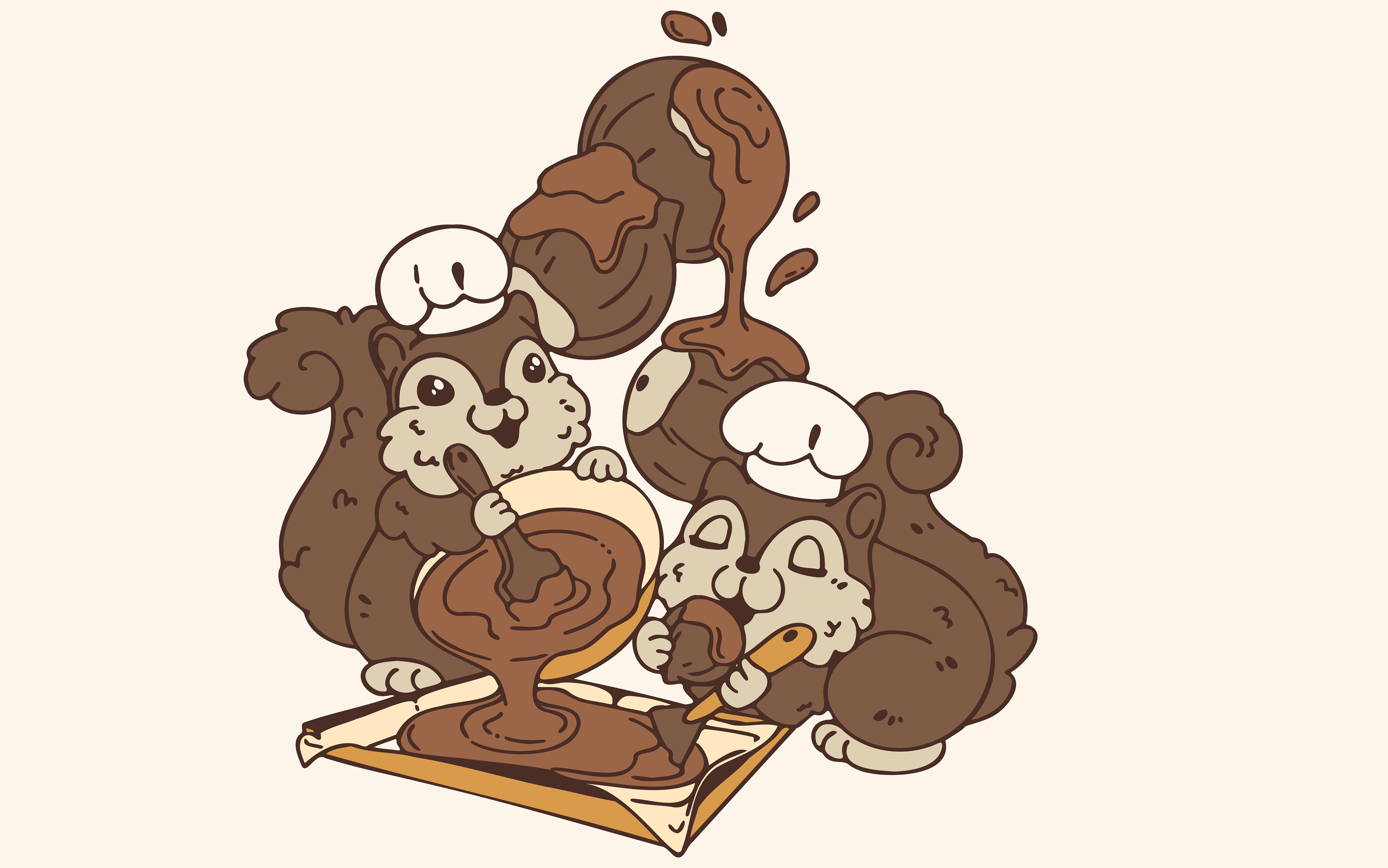
Two squirrels in chef hats stir and spread chocolate across a bar while hazelnuts drop in from above.
Nibble Nest — brand mascotsConfectionery · Line art
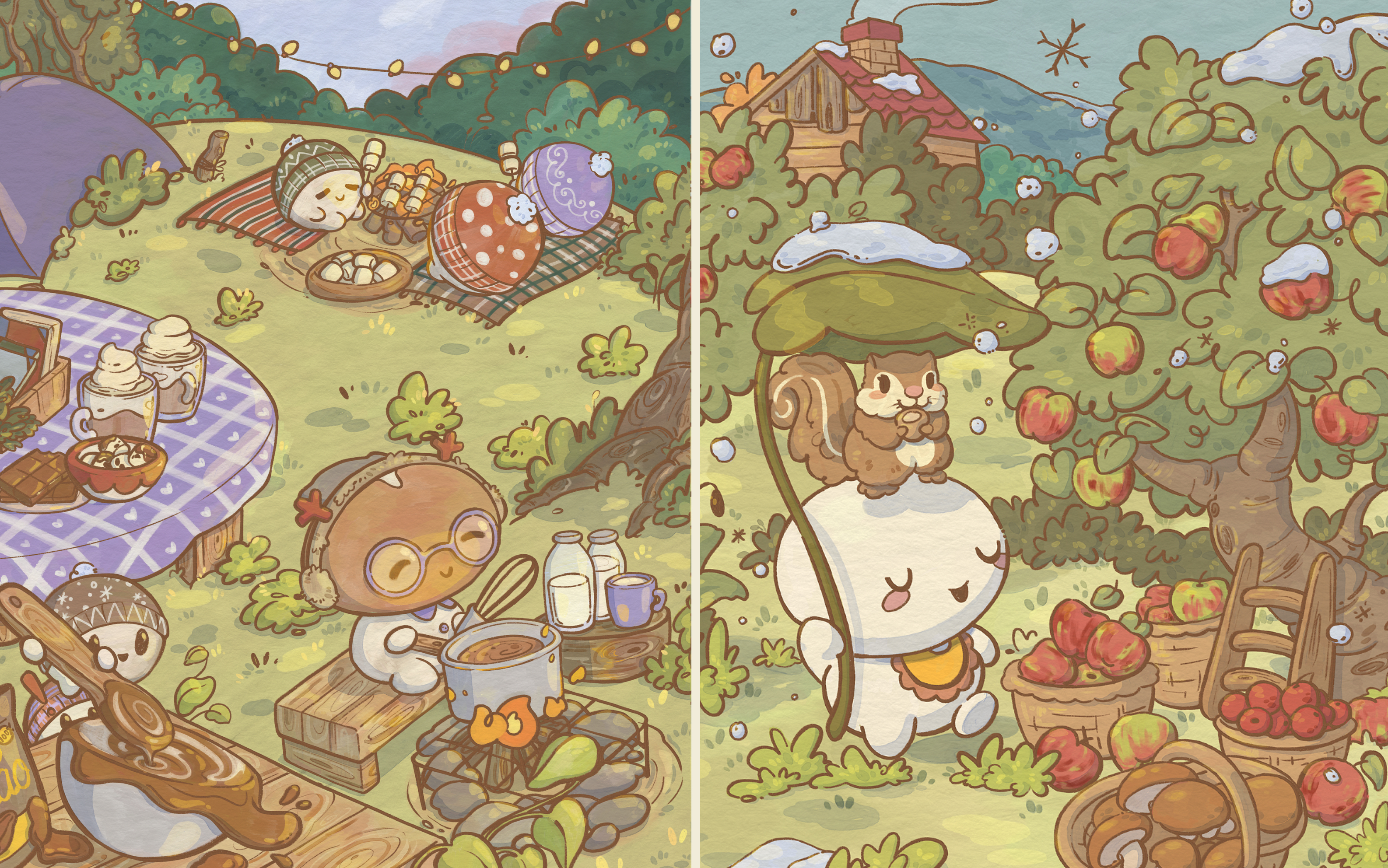
A painted pair of scenes: a summer camp picnic with marshmallows and cocoa at the left, and a snowy orchard where a squirrel shelters under a mushroom cap at the right.
Nibble Nest — seasonal campaign scenesConfectionery · Painted
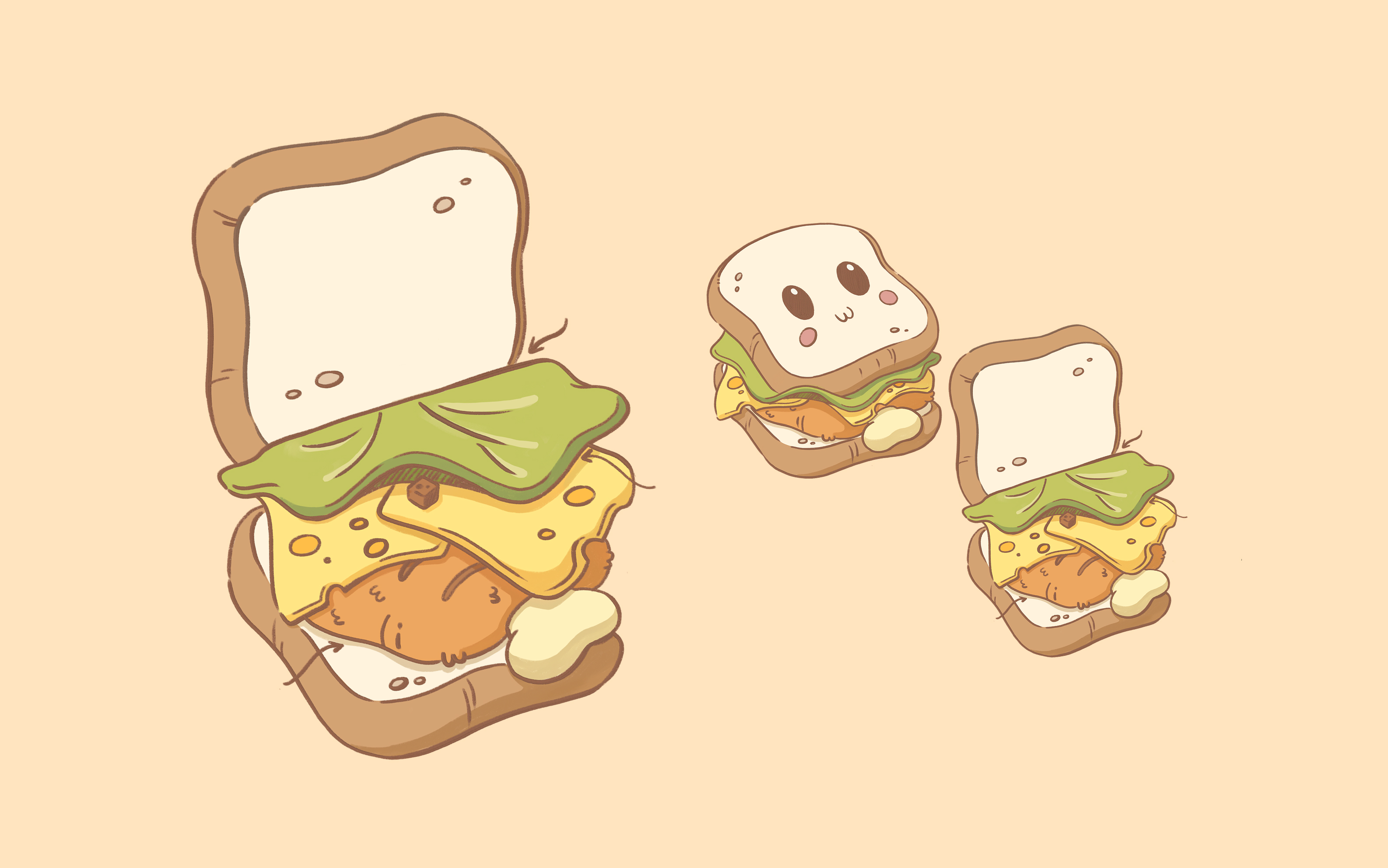
Three drawn sandwiches at descending sizes on a peach ground, the middle one with a face, its lettuce and cheese layers lifting at one corner.
Sandwich trio — product art at three sizesFood · Line and fill
A round orange character in a pink beanie carries cinnamon rolls and a coffee cup along a snowy boardwalk, with two small white characters following behind.
Winter walk — campaign sceneSeasonal · Painted
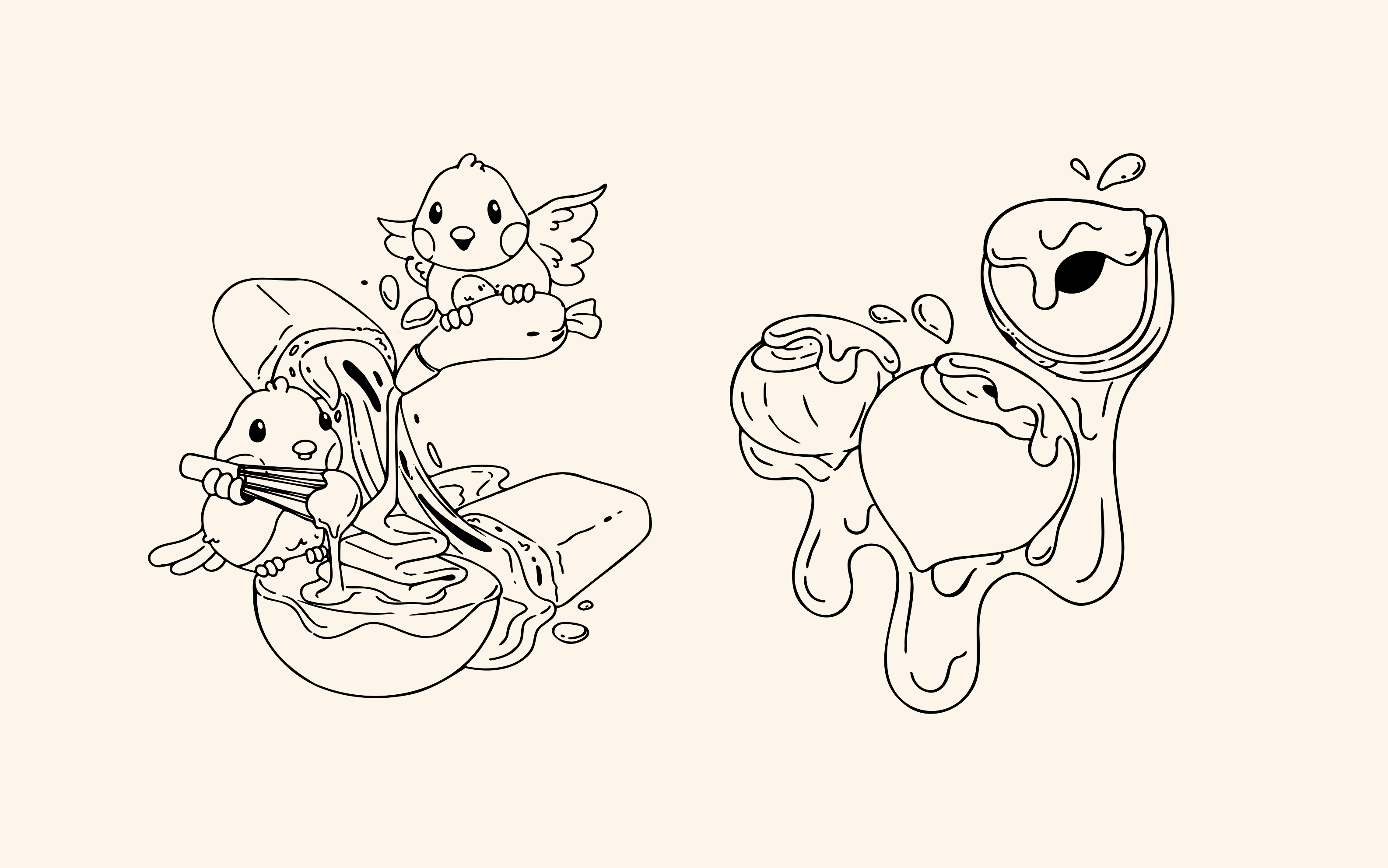
Two uncoloured spot drawings on cream: a bird and a squirrel pouring syrup over an ice lolly, and a stack of dipped fruit with chocolate running off it.
Spot art — one-colour line setAssets · Vector line
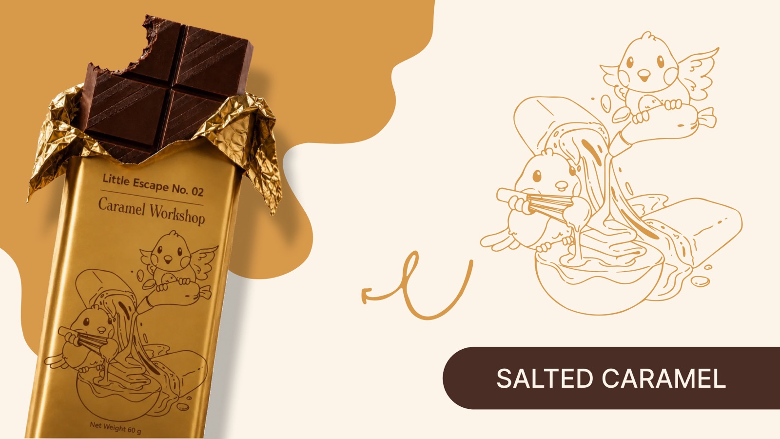
A gold foil bar reading “Little Escape No. 02, Caramel Workshop” lies half-unwrapped beside the uncoloured line drawing printed on it, of a bird and a squirrel pouring caramel over a bowl.
Nibble Nest — line art on foilConfectionery · Foil print
More on requestTell us your format and we’ll send the closest examples we have.
Not published publiclyMost client work sits under NDA
Presentation design

One idea and one graphic per page
All 6 examples
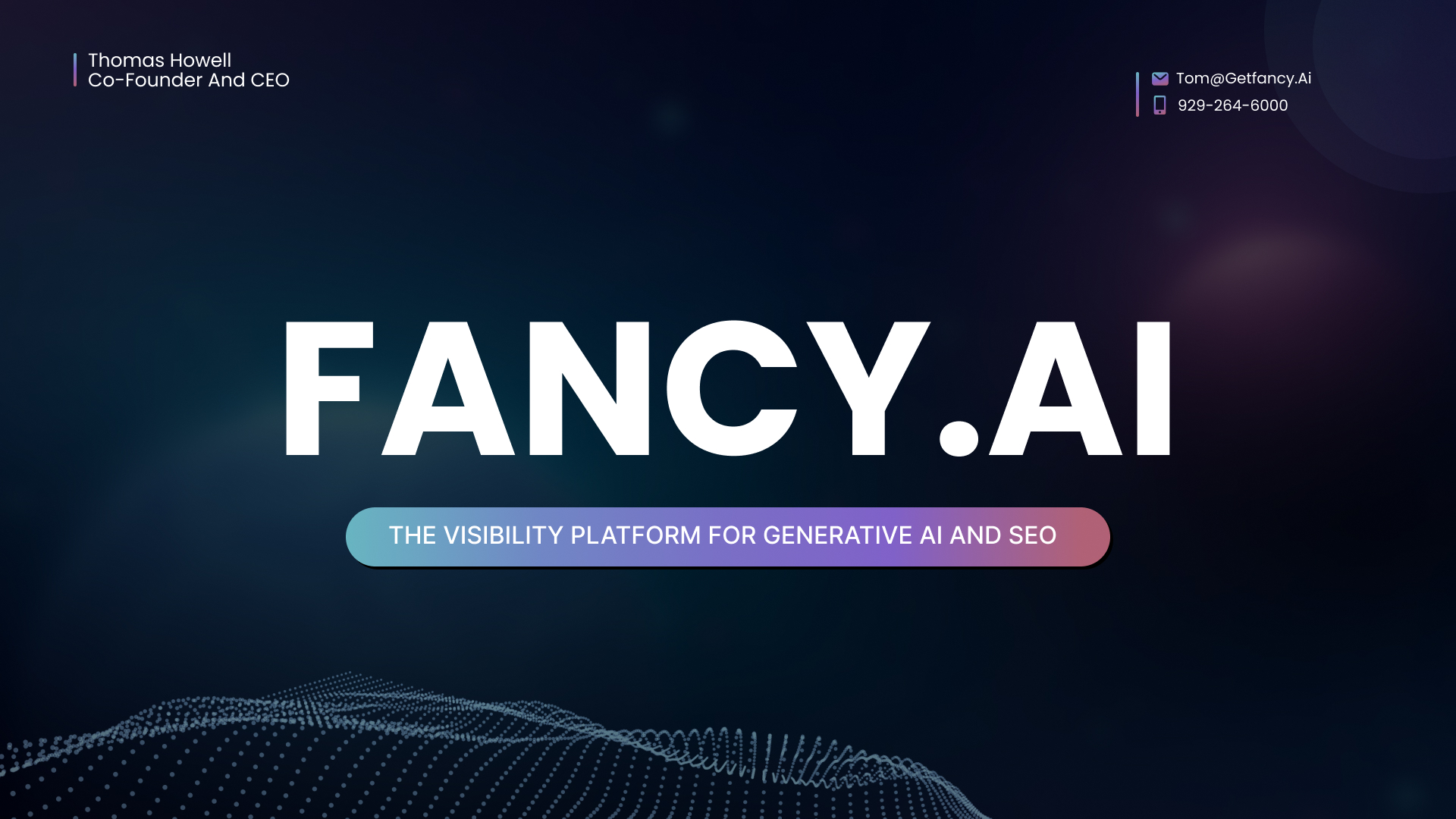
A deep navy deck cover with a large FANCY.AI wordmark, a gradient pill beneath it reading “The visibility platform for generative AI and SEO”, and a dotted wave rising from the lower edge.
Seed deck — coverFundraise · Cover
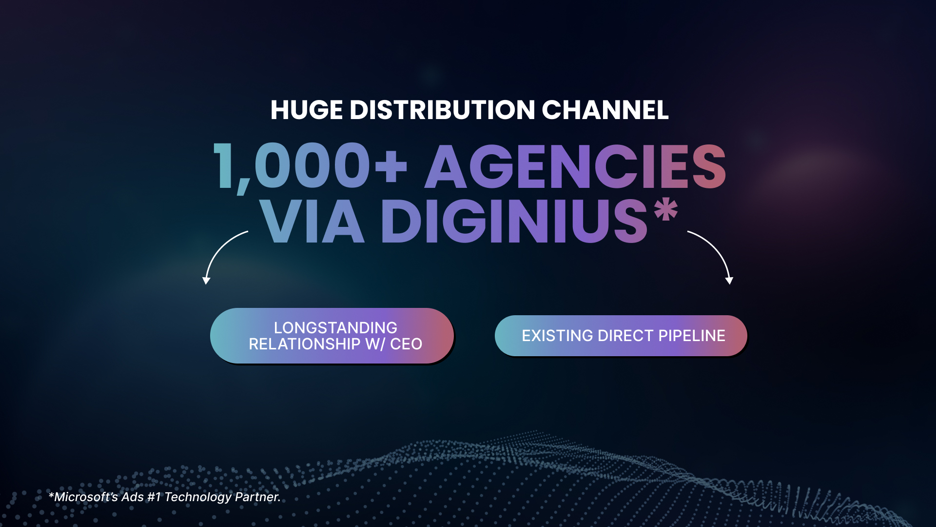
A dark slide headed “Huge distribution channel”, a large gradient headline below it, and two rounded pills linked back to that headline by hand-drawn arrows.
Distribution channel slideFundraise · Partnerships
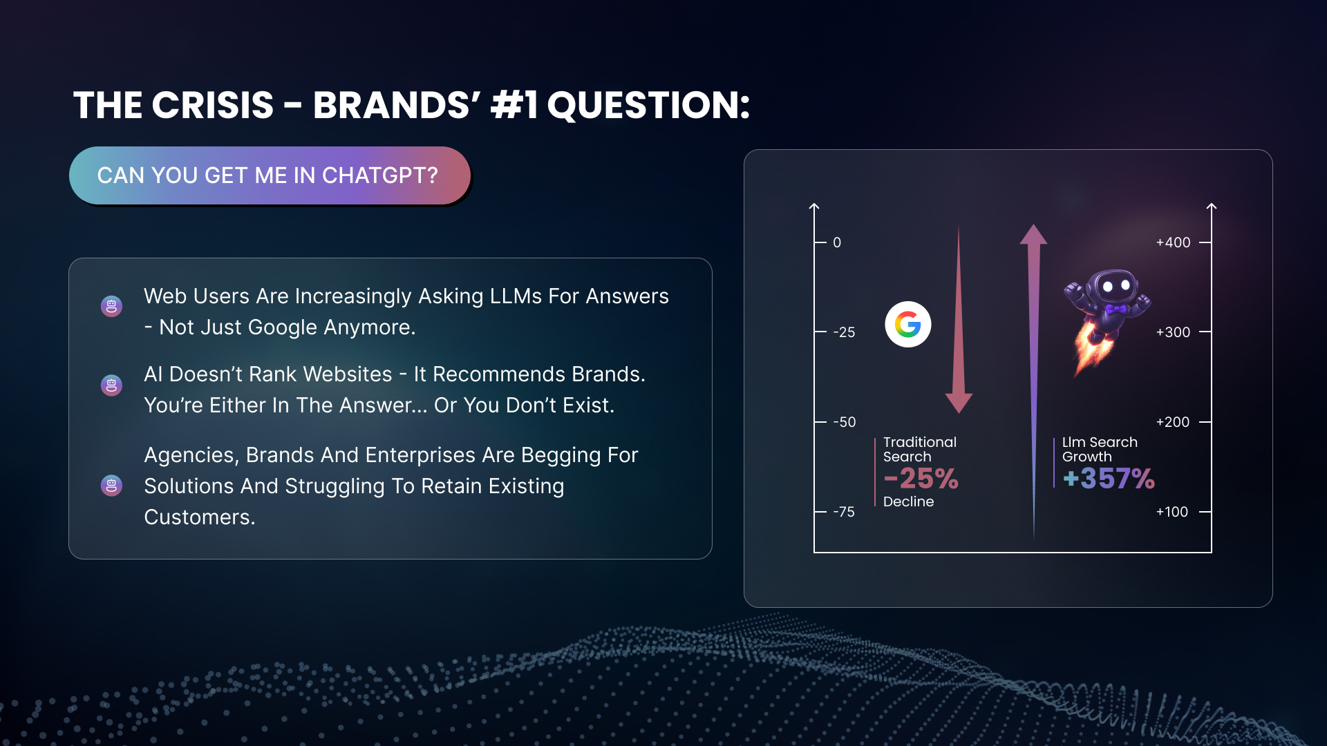
A slide headed “The crisis” with a gradient question pill, three bulleted points at the left, and a two-axis panel setting a falling red arrow against a rising gradient arrow with a rocket-powered robot.
Problem slide — the search shiftFundraise · Chart
A slide headed “All brands will want GEO” with four bulleted statements at the left and a horizontal bar chart at the right comparing conversion across traffic sources.
Conversion comparison slideFundraise · Data
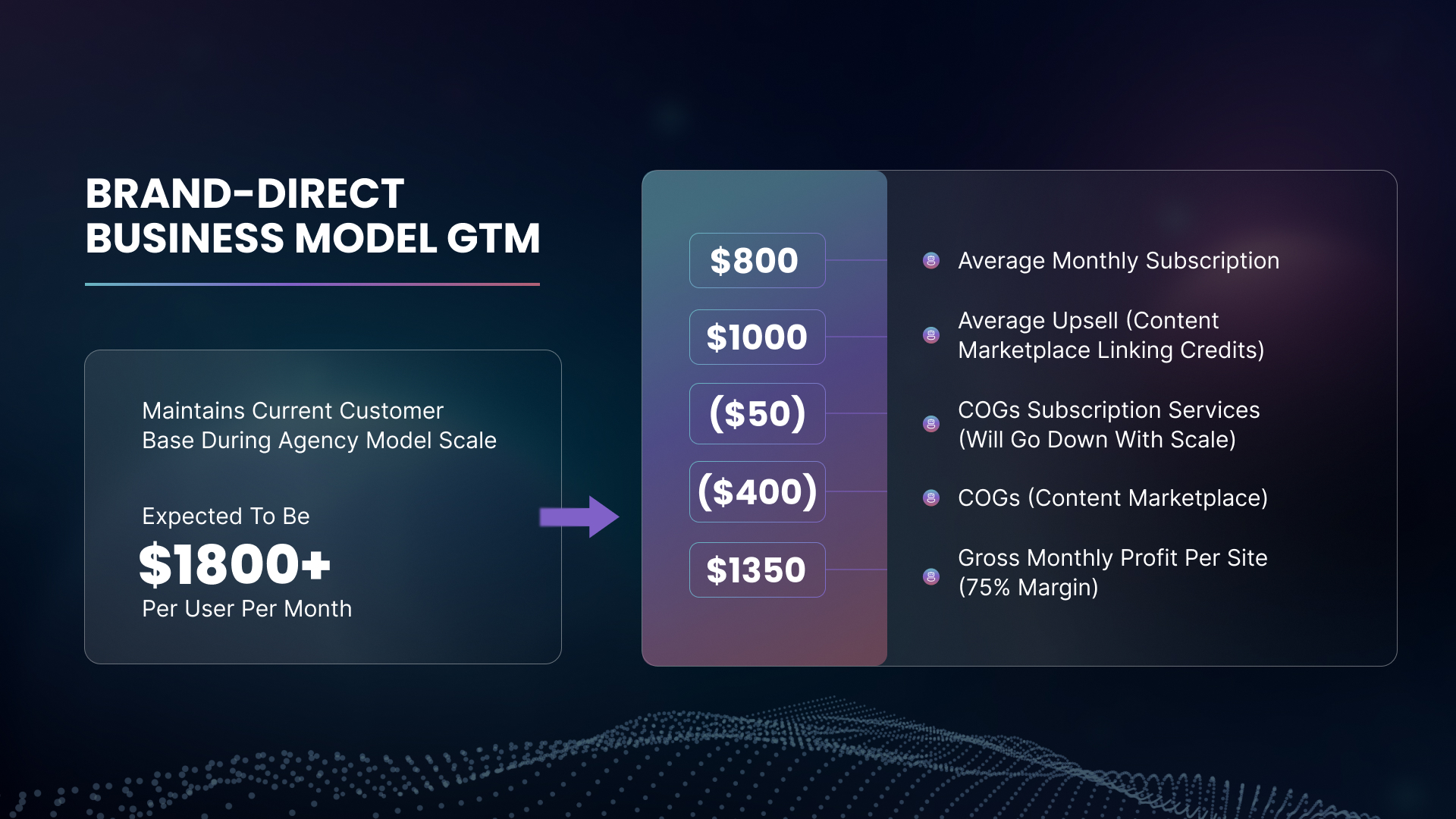
A slide headed “Brand-direct business model GTM”, a summary card at the left and a gradient column of five figure chips at the right, each linked across to a labelled line item.
Brand-direct model — build-upFundraise · Model
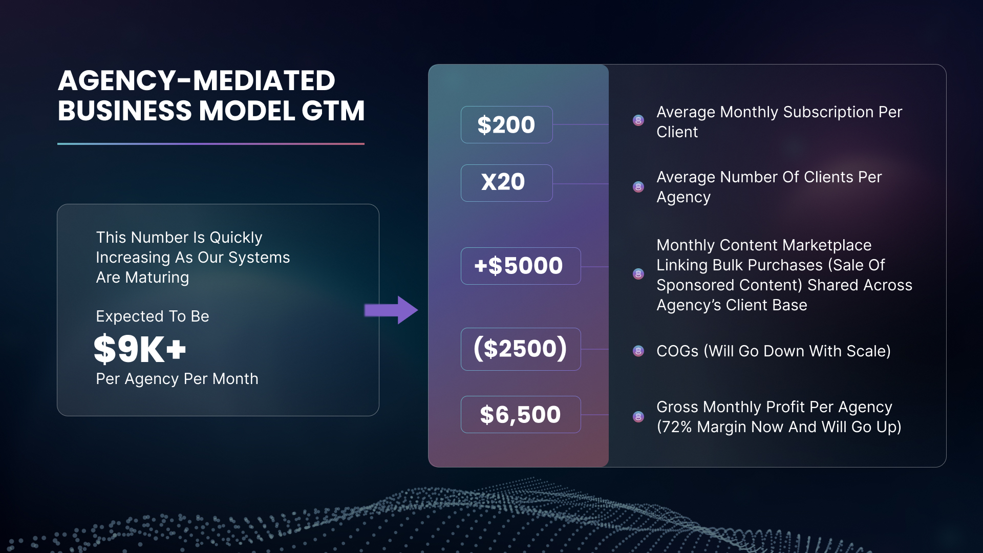
A slide headed “Agency-mediated business model GTM”, laid out to match its sibling — summary card at the left, five gradient figure chips at the right against labelled line items.
Agency model — build-upFundraise · Model
More on requestTell us your format and we’ll send the closest examples we have.
Not published publiclyMost client work sits under NDA
How a design project runs

Decisions before deliverables.

01

Brief

Audience, competitive context, and what the asset has to make someone do.

02

Direction

Two or three directions, shown at real size in real context — never as floating logos.

03

Build

The chosen direction developed into the full asset set, on one grid and one type system.

04

Review

Internal QA on spec, spelling and print readiness before you see anything.

05

Handover

Source files, export sets and a short guideline so your team can use it correctly.

06

Extend

New assets built from the same system, so month three does not drift from month one.

Questions we get asked first.

Ownership, files and rounds — settled before we start, not after.

Do we own the design and get the source files?

Yes. On final payment you own the work outright, and you get editable source files — Figma, Illustrator, After Effects — along with the exports. We do not hold your brand hostage in a file format.

How many directions do you show?

Two or three for identity work, one refined direction for campaign assets built on an existing brand. Directions are always presented in real context — on a package, in a feed, on a slide — never as a logo floating on white.

Can you work inside our existing brand guidelines?

That is most of what we do. Send the guidelines and asset library and we work within them. Where the guidelines are silent, we propose an extension and document it so the next person inherits a decision, not a guess.

Do you handle print production?

We prepare print-ready artwork to your printer’s spec — bleed, dielines, colour profiles, separations. We can liaise with the printer on proofs, though we do not manage the print run itself.

How does design work alongside video?

Thumbnails, titles and campaign creatives are designed by the same team producing the video, on the same brief. That is the point of running both verticals — the deck, the thumbnail and the edit come from one system.

What if we only need one asset?

That is fine. Project-based work is scoped and quoted once. If it turns into a recurring need, we move you onto a monthly model rather than re-quoting every request.

Bring us the campaign.We'll bring the system.

Tell us what's launching and what assets it needs. We'll scope the set and show you how it stays consistent across every channel.